
- Australia’s annual greenhouse gas emissions have increased for the first time in 10 years and are not expected to peak until after 2030, according to a new report.
By 2020 emissions will grow by 6%, leaving Australia 4% above 2000 levels compared with our official target of -5%. Not to worry, we will use carry-over credits under the Kyoto Protocol to formally meet our international commitments.
That’s according to a RepuTex report, picked up by the AFR and at RenewEconomy.
The report is based on an official national greenhouse inventory report, conveniently released on Christmas Eve, and only, as far as I’m aware, given a decent look by John Englart at Citizen Journalism.
Of course the Turnbull government’s official policy commits it to reducing greenhouse gas emissions by 26 to 28% by 2030. We will meet our formal 2020 targets by an accounting trick while emissions are actually increasing. However longer term there is now a growing disconnect between the blather we hear from Greg Hunt and reality.
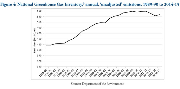
This is what the overall graph of emissions to date looks like:
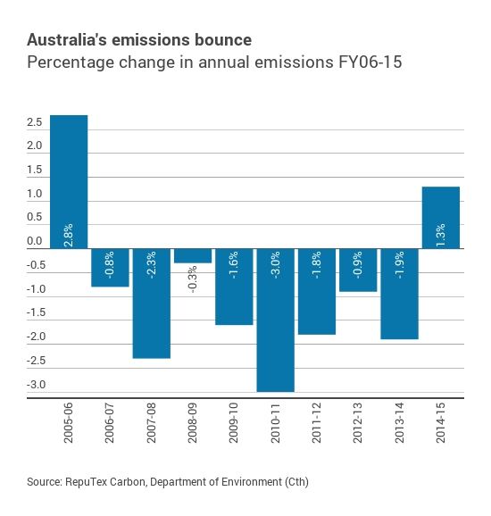
Here’s the annual change for the last 10 years:
This table shows the sectoral changes:
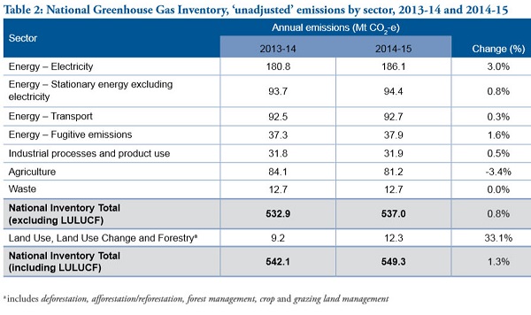
The main changes are: emissions from electricity have risen by 3% from 180.8 to 186.1Mt; emissions from agriculture have reduced by 3.4% from 84.1 to 81.2Mt; emissions from Land Use, Land Use Change and Forestry (LULUCF) have increased by 33.1% from 9.2 to 12.3Mt. Overall there was an increase of 7.2Mt or 1.3%.
The main driver for LULUCF changes stem from deforestation, mainly in Queensland where the Newman Government rolled back conservation and land clearing legislation.
The changes in agriculture stem from reduced cattle and sheep numbers due to the drought.
For electricity, Queensland was the main driver of growth, which came with reduced efficiency.
Queensland stands out because of the implementation phase of coal seam gas development. For those who came in late, the gas comes out of the wells with lots of very salty water, which has to be taken somewhere, cleaned up and in some cases reinjected. Needs lots of power.
The gas is condensed and pumped to Gladstone (a very long way), where it is liquefied, again requiring lots of energy.
In generating electricity the mix has changed markedly. Gas generation decreased by 6.2% and hydroelectric generation decreased by 30.3% (the drought, I think). Renewables (excluding small-scale solar) increased by 12.2%. A big mover was brown coal which increased by 9.7%, followed by black coal 1.4%. Here we have the annual electricity generation by fuel in the National Electricity Market, 2010-11 to 2014-15:
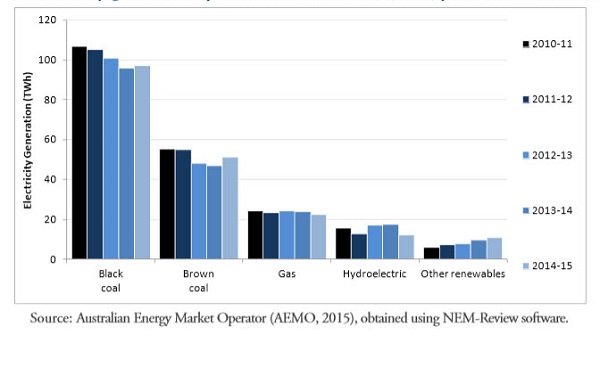
Coal is still king.
Since 1990 our population has grown by 39.5% and our GDP by 113%. I can’t find the raw change in emissions, the report turns to per capita figures.
Emissions per capita have fallen 28.4% since 1990, while the emissions intensity of the economy has fallen by 53.2% since 1990. But that’s with LULUCF (basically tree clearing). Excluding LULUCF those figures become 10% and 41.1% respectively.
The figure of 10% probably best represents our climate mitigation effort over the last 15 years. Reputex gives an estimate of our estimated mitigation performance from 2000 to 2020 along with other Annexe 1 countries:
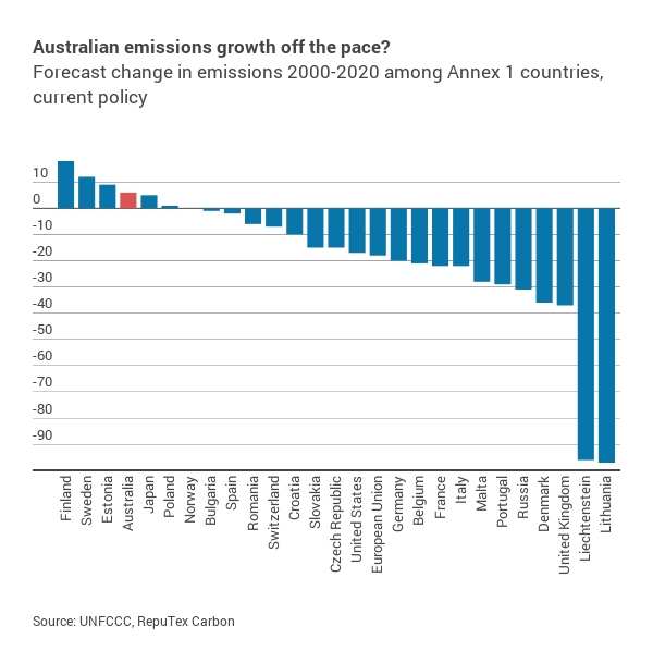
It’s not pretty, but many of them have static or falling populations.
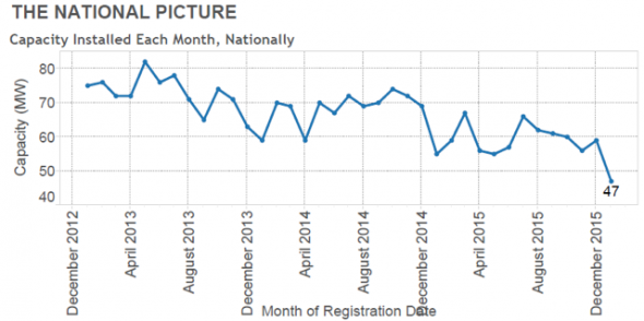
Meanwhile from Sophie Vorrath at RenewEconomy:
- January 2016 has marked the worst start to a year for solar PV growth in Australia since 2012, putting it well behind the global pace – and even behind its own depressed 2015 levels, a new report by solar analysts SunWiz has shown.
Here’s the graph that shows monthly effort since 2012:
Policy drift by the Turnbull government suits coal and the climate denialists very well indeed.