
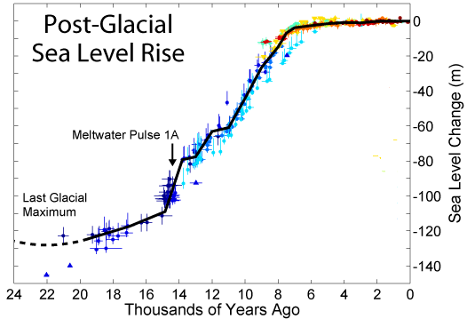
In human time-scales 100 years is long time. In geological terms in relation to sea level rise, it’s short, very short. Coming out of the last ice age seas rose a total of about 120 metres over about 11 or 12 thousand years, as this image shows:
From memory, James Hansen wrote of the time-scale for complete deglaciation of the Greenland and Antarctic ice sheets as in the region of 3 to 6,000 years. With certainty it would take multiple millennia.
In this post I’d like to paint with a broad brush in a way that is indicative rather than definitive. I don’t have time to chase down the latest piece of research at each point.
Underlying the sea level story is a broad but fairly tight relationship over the last 800,000 years between greenhouse gases, temperature and sea level, as illustrated in these graphs from Hansen:
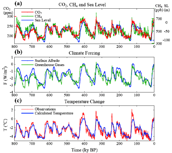
These movements in temperature and sea were achieved with CO2 varying between about 180 and 300 ppm.
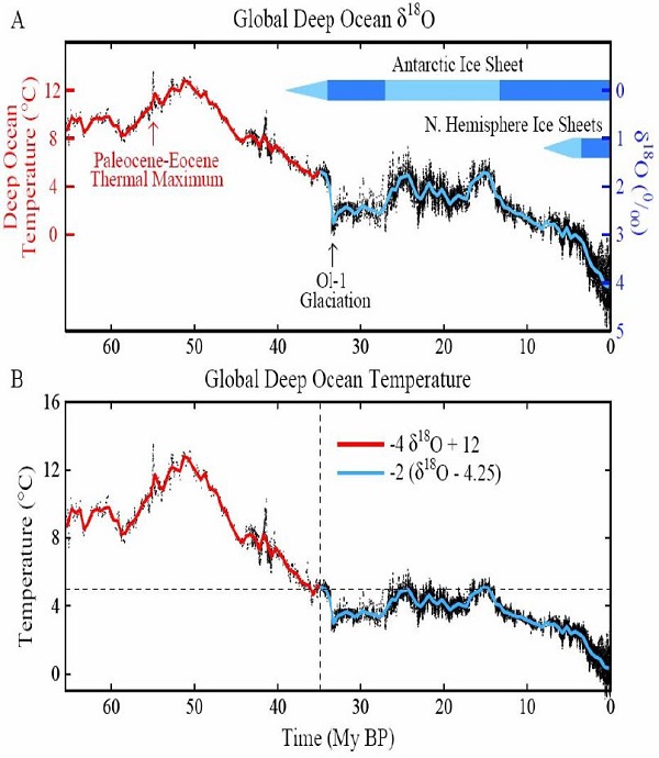
This graph, also from Hansen, shows the variation and cooling trend in the Cenozoic Era (last 65 million years), together with the introduction of glaciation, first in Antarctica, then in the Northern Hemisphere:
The following image shows shows sea level rise for the last 35 million years, expanded out to show the whipsaw effect that has prevailed since about 3 million years ago:
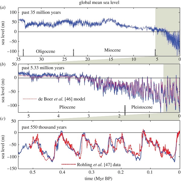
This effect is thought to be caused by the Milankovitch cycles, changes in the earth’s tilt and orbit, and began soon after the closure of the Panama Isthmus, which may have been a pre-condition. The Milankovitch cycles have been the basic driver of climate change for the last few million years until the industrial age. The rate of forcing is now many times larger, perhaps 25 to 30 times.
Back in 2008 in my series of five articles, which now unfortunately reside in a 3-month hole in the Larvatus Prodeo record, I made five statements relating to CO2, temperature and equilibrium sea level, drawn from the research literature referenced to pre-industrial times.
I’ve copied and modified these statements from this source, where, as luck would have it, a commenter copied some of my stuff without asking me.
- 1. 180ppm gives a temperature of -5 or 6°C lower than now, and a sea level rise (SLR) of -120m
- 2. 280ppm gives a temperature variance of 0°C and SLR of 0m
- 3. 280-300ppm gives a temperature variance of 1.7 to 2.7°C and SLR of 5-10m
- 4. 380 (360-400)ppm gives a temperature variance of 2.7 to 3.7°C and SLR of 25m (±5)
- 5. 500 (400-600)ppm gives a temperature variance of 5 to 7°C and SLR of 75m (complete deglaciation).
Each statement assumes that emissions will be held at nominated levels for thousands of years.
The use of the 0.7 ending reflects the quantification of the term “now” for temperature in the literature. For example, the Eemian was said to be 1 to 2°C warmer than now.
Statement 3 reflects the situation in the Eemian. I’ve replaced 4-6m with 5-10m to conform with IPCC5.
Statement 4 reflects the Pliocene. Later research by Rohling et al narrowed the uncertainty range for SLR.
In Statement 5 I’ve reverted to an earlier position held by Hansen. His 425ppm does not fit with later research by Aradhna Tripati et al, who found temperatures were ~3° to 6°C warmer and sea level was 25 to 40 meters higher than at present during the Middle Miocene. Elsewhere we are told she found CO2 to be 400-450ppm at the time.
Also Professor Barry Brook, as reported here, said on the comments thread of one of the lost posts:
- 425-450 ppm CO2 does not necessarily guarantee an ice free world. It will almost certainly wipe out the Greenland Ice Sheet (GIS) and West Antarctica Ice Sheet (WAIS) at some future point (I’d bet sooner rather than later – anywhere between a few decades to a few centuries and we are likely to be committed to this already at 385 ppm). But not necessarily the East Antarctic Ice Sheet (EAIS), or at least not all of it.
As I said, these statements are meant to be indicative rather than definitive. The temperatures and sea levels are certainly in accord with David Archer’s 2006 graph:
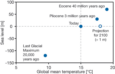
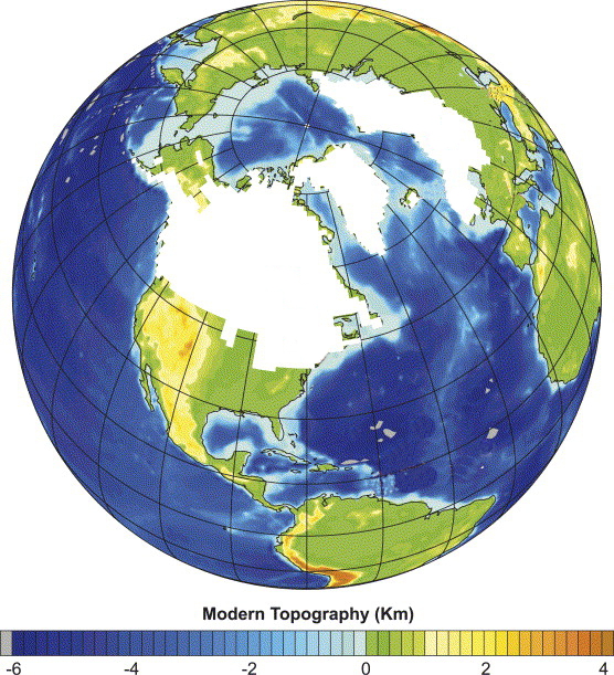
From this graph we can readily see that when 10-12°C gives you close to 200 metres of sea level change each degree means a lot. This image conveys the extent of the continental ice sheets during the Last Glacial Maximum about 22,000 years ago:
I think the Holocene floats in a 2°C temperature band where there is relatively little ice sheet activity. We appear to be at the upper limit of that band.
Paleo evidence is not fine-grained enough to help us greatly in how quickly ice sheet decay will proceed from century to century. Alternatively the observation period we have to rely upon is far too short. However, the average for the next 75m of SLR would seem to be about 15m per degree. The following image of recent post-glacial experience repeats the first at the top of the post with some additional information, principally a red line indicating the “present” rate of SLR:

The image was downloaded by me in 2009. I think “present” is likely to be 2.9mm pa.
The IPCC5 WGI Chapter 13 gives the following breakup of the contributing factors to SLR:
-
Thermal expansion – 1.1mm
Glaciers except Greenland and Antarctica – 0.76mm
Greenland – 0.33mm
Antarctica – 0.27mm
Land water storage – 0.38mm
Total – 2.8mm
Observed SLR – 3.2mm
Residual – 0.4mm
Concerning the residual, more recent research indicates that thermal expansion may have been underestimated.
The main message, though, is that current sea level rise is predominantly driven by the thermal expansion of the oceans. Yet the contribution of thermal expansion to SLR with complete deglaciation will be minor, I think in the order of several metres. The main game will be ice sheet decay.
We know that coming out of the Last Glacial Maximum SLR was very rapid at times. About 14,000 years ago Meltwater pulse 1A yielded SLR of about 20m in less than 500 years, perhaps just 200 years.
The question really is, when will ice sheet decay seriously take off? We don’t know, but as I mentioned here, Richard Alley and co have run their models and found a possible five metres in the next 200 years.
You can check out the vulnerability of various parts of the world with the Firetree flood maps.
I’ll finish with a few images.
This one shows vulnerable Asian cities, from a 2009 UNEP report:
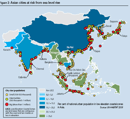
Each red dot is a city with a million or more people.
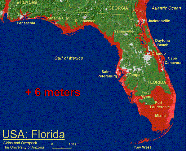
This one shows Florida with 6m of SLR:
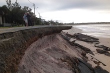
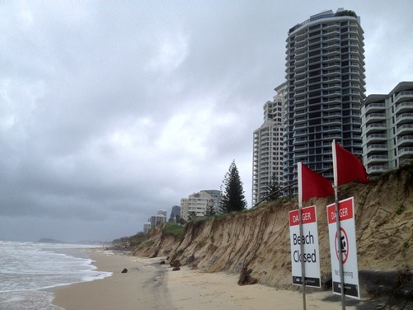
This one shows Surfers Paradise after a storm:
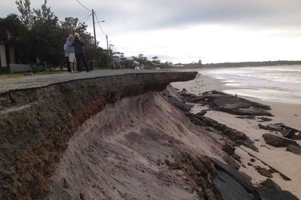
This is near Winda Woppa in NSW:
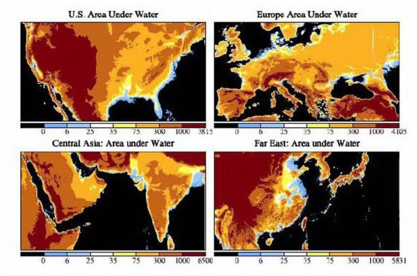
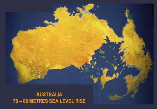
The blue and yellow bits in this image show what 75 metres does to some parts of the world:
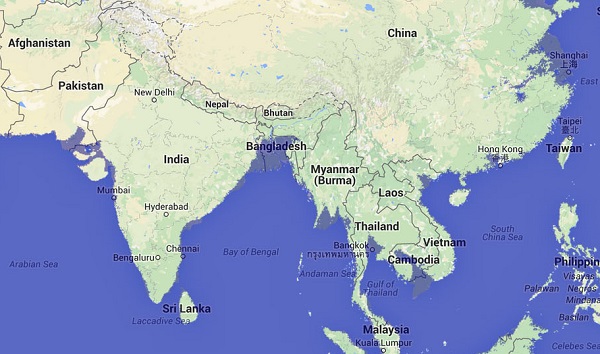
This image with 20m SLR, implied by current levels of CO2, shows Pakistan, Bangladesh, Myanmar, Vietnam, China/Hong Kong and China near Shanghai in some difficulty:
Update: Finally, this is Australia if the ice sheets melt completely from a piece by David Spratt of Climate Code Red:
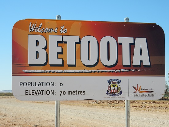
Here’s the sign coming into Betoota in SW Queensland:
See also: Ice sheet decay spells danger from sea level rise for how sea level rise may progress in the next century or three.
Update June 2018: See also Antarctic ice loss rates have tripled since 2012
An impressive set of data Brian that goes well beyond sea level.
Should be added to Key Posts?
Probably, John. I would have liked to spend more time researching the area.
The data presented has implications for climate sensitivity. The increase in temperature from the Last Glacial Maximum to the Holocene was achieved with less than doubling CO2 from 180 to 280ppm.
Thanks a lot for that wealth of graphs. Wow!