The government has produced the latest State of the Environment Report 2016 which happens every five years. I’ve browsed the report and can say that it has some magnificent photographs.
According to the ABS Australia’s population will be between 36.8 million and 48.3 million in 2066 as against 24 million now. The report says that the key drivers of environmental change are population growth and economic activity.
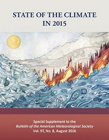
NOAA’s annual State of the Climate report has recently been released, showing the climate change is proceeding apace on all fronts. The 300 page report compiled by 450 scientists from 62 countries confirmed there was a “toppling of several symbolic mileposts” in heat, sea level rise and extreme weather in 2015. From The Guardian:
“The impacts of climate change are no longer subtle,” Michael Mann, a leading climatologist at Penn State, told the Guardian. “They are playing out before us, in real time. The 2015 numbers drive that home.”
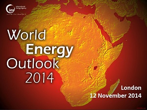
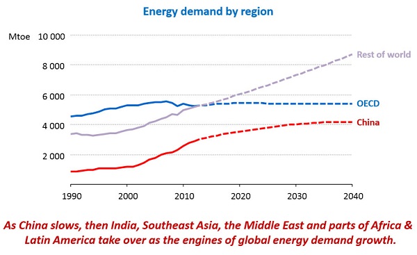
By 2040 three quarters of our energy will still come from fossil fuels, with global energy demand increasing by 37% and emissions increasing by 20%, according to the IEA world energy outlook 2014. IEA Chief Economist Fatih Birol:
The International Energy Agency estimates the planet is on track to warm by 3.6 degrees Celsius. Investment in renewables needs to quadruple to an average of $1.6 trillion every year through 2040 to meet the 2-degree target.
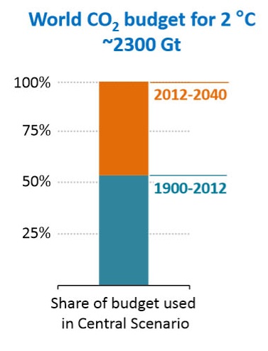
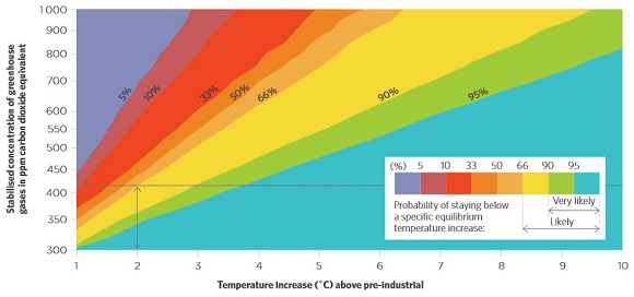
Taking the world’s CO2 budget to limit warming to 2°C as 2,300 Gt of CO2 from 1900, we have 1,000 Gt left from 2014, and are set to use all of it by 2040:
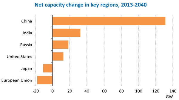
Overall energy demand is set to grow by 1% pa, about half the growth experienced in recent decades. Demand is flat in the OECD, slowing in China, but growing vigorously in the rest of the world:
By 2040, the world’s energy supply mix will divide into four almost-equal parts: oil, gas, coal and low-carbon sources, including renewables, hydro and nuclear. Growth in oil and coal will taper to nothing, but gas will grow vigorously, with demand increasing by 50% by 2040.
Oil
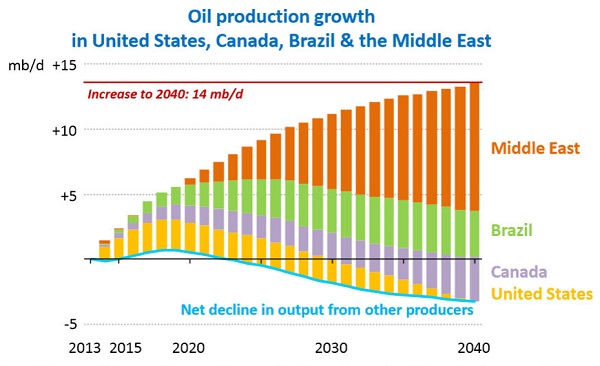
World oil supply rises to 104 million barrels per day (mb/d) in 2040, but hinges critically on investments in the Middle East. As tight oil output in the United States levels off, and non-OPEC supply falls back in the 2020s, the Middle East becomes the major source of supply growth. Growth in world oil demand slows to a near halt by 2040: demand in many of today’s largest consumers either already being in long-term decline by 2040 (the United States, European Union and Japan) or having essentially reached a plateau (China, Russia and Brazil). China overtakes the United States as the largest oil consumer around 2030 but, as its demand growth slows, India emerges as a key driver of growth, as do sub-Saharan Africa, the Middle East and Southeast Asia.
The changes in supply are shown graphically below:
Concern is expressed that ISIS is deterring investment in production in Iraq.
Oil prices are likely to rebound, averaging $82.50 a barrel in 2015 and rising to near $100 in the coming years.
Coal
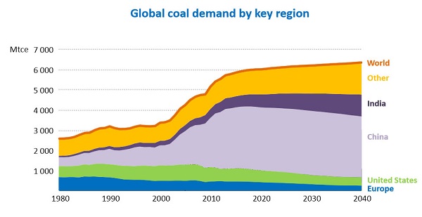
Global coal demand will grow by 15% to 2040, but almost two-thirds of the increase will occur over the next 10 years.
Chinese coal demand plateaus at just over 50% of global consumption, before falling back after 2030. Demand declines in the OECD, including the United States, where coal use for electricity generation plunges by more than one-third. India overtakes the United States as the world’s second-biggest coal consumer before 2020, and soon after surpasses China as the largest importer.
Australia will pass Indonesia to once again become the largest exporter by 2030.
The graph shows the importance of China in the global market:
The graph also highlights the folly of India and developing countries polluting their way to prosperity.
Gas
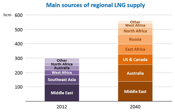
The key uncertainty – outside North America – is whether gas can be made available at prices that are attractive to consumers while still offering incentives for the necessary large capital-intensive investments in gas supply; this is an issue of domestic regulation in many of the emerging non-OECD markets, notably in India and across the Middle East, as well as a concern in international trade.
If these uncertainties are met the world gas market will be transformed with Australia a major beneficiary:
60% of gas will be ‘unconventional’, meaning shale and coal seam.
There is uncertainty about the $900 billion per year in upstream oil and gas development needed by the 2030s to meet projected demand.
Nuclear
The IEA sees global nuclear power capacity increasing by almost 60%. However, its share of global electricity generation will rise by just one percentage point to 12%.
Some 38% of existing capacity will be retired. Once again the importance of China is seen in this graph of the changes in capacity of the key players:
Renewables
Renewables will account for almost half of the increase in total electricity generation to 2040.
The share of renewables in power generation increases most in OECD countries, reaching 37%, and their growth is equivalent to the entire net increase in OECD electricity supply. However, generation from renewables grows more than twice as much in non-OECD countries, led by China, India, Latin America and Africa. Globally, wind power accounts for the largest share of growth in renewables-based generation (34%), followed by hydropower (30%) and solar technologies (18%).
Global subsidies amount to $120 billion compared to $550 billion for fossil fuels.
The growth in hydropower is an ecological concern.
Paris and prices
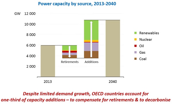
The Executive Summary leads with a statement about the uncertainty of energy futures in very troubled times, so the IEA forecasts must be seen in this light. The IEA is urging strong intervention by decision makers in the UNFCCC conference in Paris in December, to avoid a climate catastrophe. They call it the last chance. Worth noting here is that the 2011 World Energy Outlook found that all new power supply built after 2017 would need to be zero carbon.
I’m not sure the IEA is fully aware of how cheap renewable technologies are becoming, and how disruptive these technologies will be. Nevertheless their mainstream future, dubbed the “central scenario”, already has renewables comprising about half of new capacity. The changing pattern in power supply is captured as follows:
Clearly we are relying too much on gas and coal for new supply, and we need to retire more dirty power, especially brown coal.
Sources
Unfortunately one can’t read the full report without buying it so I’ve had to make do with links, mostly from this page. The Executive Summary provides the story in words, the pictures all come from the London presentation.
Finally, BP has taken a look at the future. What they find is not dissimilar to the IEA, just heading down the crapper a bit faster. They see global energy consumption in 2035 as 37% greater than now and CO2 emissions 25% more. They see a clear role for themselves to make a buck while cooking the planet.
Environment minister Greg Hunt, Radio National, November 17:
If you use the full Kyoto period — 1990 to 2020 — the US is minus 5% and Australia is almost exactly the same.
Joe Hockey made a similar statement that “If you compare apples with apples, the American position and our position on reductions are effectively the same.”
The comparisons are complex, because the starting and finishing dates are different, so are the population increases. Moreover Australia has forestry and tree clearing in the mix.
Malte Meinshausen and Anita Talberg make the necessary adjustments and find:
An apples-with-apples comparison shows that Australia lags far behind the United States in efforts to reduce greenhouse gas emissions from its energy, transport and industrial sectors.
To match US efforts, Australia would have to increase its 2020 ambitions from the current 5% below 2000 to 21% or even 29%, depending on whether different population growth is taken into account, or not.
In short, they lie!
3. The genius of Tony Abbott’s stance on climate
At New MatildaTom Allen comments on Tom Switzer’s claim the Abbott is a climate change genius. Switzer is a climate change denialist, so we won’t bother with that! Allen finds Abbott has proved one thing – that a carbon tax works!
Abbott
will be remembered as the Prime Minister who proved that the carbon tax worked. After it was introduced, Australia’s carbon dioxide emissions fell, the economy continued to grow and the sky remained in place.
When Abbott repealed it and the country’s emissions began to rise again, using Australia as a vast laboratory, Abbott confirmed it: carbon taxes work.
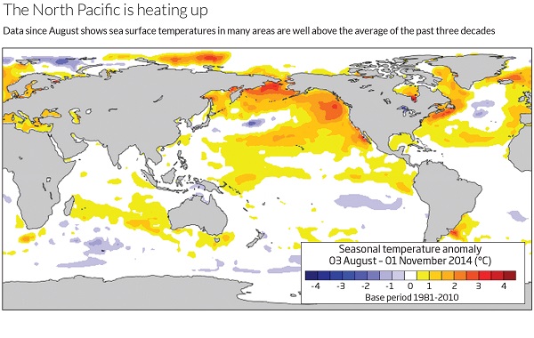
The world’s oceans are the hottest they’ve ever been in the modern record, especially in the northern Pacific.
In July this year, ocean surfaces were 0.55 °C above the average since 1890, just beating the previous record of 0.51 °C in 1998. In the North Pacific, the temperatures were about 0.8 °C above average, which is 0.25 °C warmer than the 1998 peak.
No explanation is given as to why this pattern has emerged. However, it does seem to be disrupting the development of an El Niño. Small mercy, because the northern Pacific warming has effects similar to an El Niño:
This includes more hurricanes in the Pacific, as well as more storms curling over into mainland US. Meanwhile, there have been fewer hurricanes in the Atlantic, just as happens during El Niño. Elsewhere, dry conditions have occurred across Australia, and the Indian monsoon was delayed – effects all arising from warm oceans, despite the lack of an El Nino event.
6. Turn down the heat : confronting the new climate normal
This is volume 2 of 2 of a report prepared for the World Bank by the Potsdam Institute for Climate Impact Research and Climate Analytics, and hence highly authoritative. The lead author was Hans Joachim Schellnhuber of the Potsdam Institute.
It’s a massive 320 page report. This is from the Foreword:
There is growing evidence that warming close to 1.5°C above pre-industrial levels is locked-in to the Earth’s atmospheric system due to past and predicted emissions of greenhouse gases, and climate change impacts such as extreme heat events may now be unavoidable.
As the planet warms, climatic conditions, heat and other weather extremes which occur once in hundreds of years, if ever, and considered highly unusual or unprecedented today would become the “new climate normal” as we approach 4°C—a frightening world of increased risks and global instability.
The consequences for development would be severe as crop yields decline, water resources change, diseases move into new ranges, and sea levels rise. Ending poverty, increasing global prosperity and reducing global inequality, already difficult, will be much harder with 2°C warming, but at 4°C there is serious doubt whether these goals can be achieved at all.
That’s about as far as I could get tonight. Climate Progress has a post.
This edition looks at changes in the cryosphere, a major US report, the prospects for an El Niño and the problem of China burning coal.
1. Pacific Ocean hot spot
Scientists have discovered a hot spot in the Pacific Ocean which is partly responsible for global warming in the Arctic. Incredibly this hot spot is east of Papua New Guinea.
This phenomenon is attributed to natural variations rather than global warming. Therein, perhaps, lies the reason that scientists have been constantly surprised by the rapidity of the Arctic sea ice loss.
2. Southern Ocean winds strengthening and moving south
Scientists have confirmed in a study covering the last 1000 years that winds are strengthening in the Southern Ocean and moving south. They found a definite trend greater than can be explained by natural variability and attributable to the effect of increased greenhouse gases.
Hence the drying of southern Australia is expected to continue. Also the tightening of winds around Antarctica inhibits warming of the continent. Nevertheless the warming of West Antarctica is considerable.
3. Antarctic glaciers melting past point of no return
A group of melting glaciers in West Antarctica appears to have reached the point of no return according to scientists from NASA and the University of California Irvine. Even if we cut back greenhouse gas emissions savagely now the melting will continue. We are probably looking at 3 to 5 metres of sea level rise, from Antarctica alone – that is our gift to future generations. Dangerous climate change is no longer just a future possibility, it’s happening now!
The question is, how long will it take? Here there is uncertainty. It could be as short as two centuries or as long as nine. Professor Eric Rignot thinks two centuries is “not outrageous”.
4. East Antarctica more vulnerable than thought
Part of East Antarctica is more vulnerable than expected to a thaw that could trigger an unstoppable slide of ice into the ocean and raise world sea levels for thousands of years, a study showed on Sunday.
The Wilkes Basin in East Antarctica, stretching more than 1,000 km (600 miles) inland, has enough ice to raise sea levels by 3 to 4 meters (10-13 feet) if it were to melt as an effect of global warming, the report said.
The Wilkes is vulnerable because it is held in place by a small rim of ice, resting on bedrock below sea level by the coast of the frozen continent. That “ice plug” might melt away in coming centuries if ocean waters warm up.
“East Antarctica’s Wilkes Basin is like a bottle on a slant. Once uncorked, it empties out,” Matthias Mengel of the Potsdam Institute for Climate Impact Research, lead author of the study in the journal Nature Climate Change, said in a statement.
Wilkes basin could be more vulnerable than West Antarctica, but perhaps on longer time scales. Again there is concern with tipping points. James Hansen famously said, You can’t sling a rope around an ice sheet!
5. Climate change is clear and present danger, says landmark US report
Climate change has moved from distant threat to present-day danger and no American will be left unscathed, according to a landmark report due to be unveiled on Tuesday.
The National Climate Assessment, a 1,300-page report compiled by 300 leading scientists and experts, is meant to be the definitive account of the effects of climate change on the US. It will be formally released at a White House event and is expected to drive the remaining two years of Barack Obama’s environmental agenda.
The findings are expected to guide Obama as he rolls out the next and most ambitious phase of his climate change plan in June – a proposal to cut emissions from the current generation of power plants, America’s largest single source of carbon pollution.
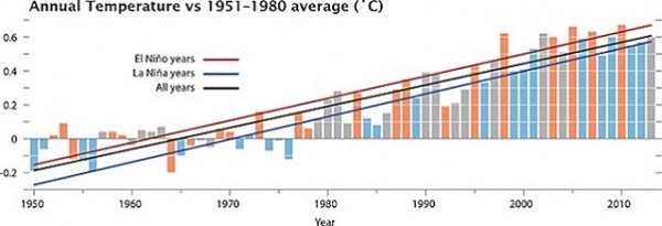
The chances of an El Niño developing this year are now at almost 80% according to some estimates. This graph shows the increased temperature in El Niño years.
It could be a warm one.
Parts of the western United States suffering chronic drought could have flooding rains. In Oz where large areas are in drought, there would be even less chance of relief.
7. China, please stop using coal!
China should put a cap on greenhouse gas emissions from coal by 2020, and then swiftly reduce its dependency on the fossil fuel, according to a new study. Otherwise climate change will be impossible to stop.
Of relevance, back in 2011 the IEA said that after 2017 any new fossil fuel power generation should be matched by the decommissioning of equivalent existing capacity.
Reminder: Use this thread as an open thread on climate change.
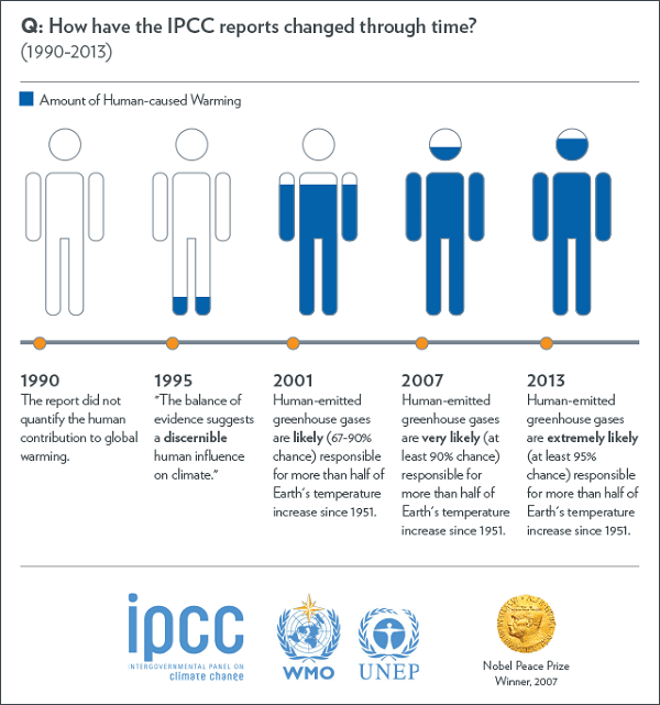
On 31 March the IPCC released its second report in the current series, this one on Impacts, Adaptation and Vulnerability. Follow the links from the report website. We looked at the first report, The Physical Science Basishere, here and here. The third report, Mitigation of Climate Change is now also out, and the final Synthesis Report is scheduled for in September. The series comprises the Fifth Assessment Report.
The IPCC was formed in 1988 and produced assessment reports in 1990, 1995 and 2007. As Graham Readfearn says, the message is the same – we are going to hell in a handbasket – and yes, at that level it’s becoming monotonous.
There is a change, however. It lies in the fact that the impacts of climate change are now all around us. We are not just getting warnings, we are living climate change. The impacts we see locally are integrating into a global pattern, which also includes large-scale transforming events, such as the drying of the Sahel and the loss of sea ice in the Arctic. Increased extreme weather is becoming part of the common experience. In this we are on a path where one in 100 events in any year may become one in three or five. We risk losing whole ecosystems such as the coral reefs where many are in trouble now and all will be by about mid-century, almost certainly. Finally, there is much greater certainty that climate change is happening and about our agency in it. With that certainty comes greater risk, but also opportunity to take action to adapt and to mitigate.
The report is organised into two “volumes”, with the first containing 20 chapters, including, for example, one on Human health: impacts, adaptation, and co-benefits and one on Human security. These sectoral reports will provide valuable reference material for years to come.
The second volume comprises 10 “regional aspects” including the ocean.
There is the possibility of widespread and permanent damage to coral reef systems, particularly the Great Barrier Reef and Ningaloo in Western Australia.
Some native species could be wiped out.
There is the chance of more frequent flooding causing damage to key infrastructure.
In some areas, unprecedented rising sea levels could inundate low-lying areas.
In other areas, bushfires could result in significant economic losses.
More frequent heatwaves and temperatures may lead to increased morbidity – especially among the elderly.
Those same rising temperatures could put constraints on water resources.
Farmers could face significant drops in agriculture – especially in the Murray-Darling Basin.
University of Queensland marine scientist Ove Hoegh-Guldberg worries that reefs could be severely damaged or disappear by mid-century.
A worst case scenario could see agricultural production reduce by 40% in the Murray-Darling Basin, and in south-east and south-west Australia. The National Irrigators Council says that’s why you have irrigation. However, there is a lot of dry-land farming in these areas and the future average rain is more likely to come in the form of floods when most of the water flows through to the sea.
The above scenarios are risks rather than certainties. However, they add up to a strong chance of dangerous climate change.
Increased certainty
The change in certainty in the attribution of climate change to human activity is conveyed in this image from Dr Jeff Masters’ WunderBlog last year:
Back in 1990 we saw the possibility of continuing change but what we had experienced at that time could easily have been natural variations subject to reversal. In any case there was low confidence that we could do anything to mitigate. Furthermore, why take measures to adapt, when there was no real certainty?
Now the story has changed dramatically. The pattern and the dominant causes are clear.
Adaptation
From page 27 of the Summary for Policymakers we find a graphic packed with information about various aspects of the impacts of climate change (sorry the graphic is too large to display here!) In the right hand column we find bar graphs showing the present, near-term (2030-2040) and the long-term (2080-2100) risk with hatching to show potential for mitigation through adaptation. The long-term risk is displayed in separate 2°C and 4°C bars.
Little adaptation is possible with Australia’s coral reefs, none at 4°C when the risk becomes very high.
Terrestrial ecosystems losing ice cover in the polar regions are similarly not amenable to adaptation and become very high risk at 4°C.
Loss of crop productivity becomes very high risk at 4°C with little possibility of adaptation. Ditto for heat-related mortality in Asia, North America and, presumably, elsewhere.
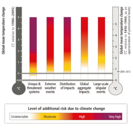
Burning embers
The extensive detail in these tables is summarised in a new improved version of the ‘burning embers’ diagram, shown below:
From this we can readily see that the 2°C ‘guardrail’ marks a fairly arbitrary point on the gradation from dire to downright dangerous.
I have a draft post in the bin, which I’ll publish after Easter. Labor are likely to adopt the enhanced targets it recommends, whereas the LNP have confirmed they won’t go beyond 5% by 2020.
Second, I’m working on a post on the IPCC’s second report in the current series, released on 31 March Impacts, Adaptation and Vulnerability. To get a head start you can follow the links from the report website.
I should be able to finalise the post for the week after Easter.
The IPCC mitigation report puts the cost of action at 0.06% of GDP, but calculating the cost is complex, especially when looking at the damage caused by doing nothing.
Yet crisis trumps uncertainty, we have no real choice but to act.
3. Trouble in the vineyards
Early ripening is becoming a huge problem for growers and wineries.
growers say they’re having trouble processing their crop because it’s ripening too quickly.
Researchers are blaming climate change, with warmer conditions and drier soils accelerating the ripening process.
4. Microbes cause Permian–Triassic extinction?
The Permian–Triassic extinction event, commonly known as the Great Dying, was responsible for the extinction of roughly 90% of all life on Earth.
According to new research at MIT the event may have been caused by microbes.
The team’s research indicates that the catastrophic event was in fact triggered by the tiniest of organisms, a methane-releasing microbe called Methanosarcina. New evidence suggests that at the time of the extinction, the microbes appeared in massive numbers across the world’s oceans, spreading vast clouds of the carbon-heavy gas methane into the atmosphere. This had the effect of altering the planet’s climate in a way that made it inhospitable to most other forms of life inhabiting Earth at that time.
5. Land clearing returns to Qld
According to The Wilderness Society the Queensland Government has approved the clearing of 30,000 hectares at Strathmore Station in the Gilbert River catchment in the Gulf country, which will add the equivalent of 4.2-6.6 million tonnes of carbon dioxide into the atmosphere, the same as running up to another 2.6 million cars on our roads.
Strathmore wants to clear another 70,000 hectares. Together with another proposed Gilbert River project, IFED’s so-called Etheridge mega farm, the two schemes would clear and flood 200,000 hectares of land.
That would be like bulldozing a 10km wide strip for 200km.
6. Instruments of persuasion
Dr Rod Lamberts of the Australian Centre for Public Awareness of Science at the ANU says it’s time to dump science and facts as instruments of persuasion in favour of advertising and marketing. He says we need to appeal to people’s emotions, which will
have a stronger effect than trying to appeal to their brains via some kind of, you know, fact channel.
But please note, the facts are needed to support the campaign:
If the goal is to affect change, then I believe we need to step more into the realms of advertising and marketing and so on, in terms of delivering messages that are supported by what the science is telling us, but don’t have the science in those messages. (Emphasis added)
Jane Caro agrees on the need for a different approach:
Facts have never changed anyone’s mind about anything, sadly. It’s very hard for scientists to understand this, because they’re highly rational people, but in actual fact, no-one has ever been rationalised out of a belief.
There are only two things that change people’s attitudes and behaviour, particularly their behaviour, and they’re two emotions, and they’re hope and fear.
Again, facts and the science are surely needed to rationalise a changed belief. Beliefs need reason to support them.
Who mounts and pays for an advertising and marketing campaign? We look to governments, but in Australia they are the actual problem.
7. Direct Action less popular than the price on carbon
Meanwhile Essential Media Communications have done a survey of opinion that shows Direct Action distinctly less popular than the price on carbon. In terms of age, there is a tipping point beyond which the doubters predominate and it’s age 55. Abbott’s climate policy may come back to bite.
as the flat-earthers take control of the Federal Government, more Australians than ever have come to the conclusion that the Earth is in fact round.
Changing our policymakers seems the best way home but then Labor needs to offer more than tokenism. In my opinion Labor politicians should be the prime target group. The current mob won’t change without a spell in opposition and transformational ideological renewal.
This is a wrap of some of commentary on the recent IPCC report. You can follow the links, or not, according to your needs, time and desires.
Climate Code Red carries a very clear summary of the report, which they got from Climate News Network, a handy site I wasn’t aware of.
The summary covers elements I neglected, such as Evaluation of Climate Models, but doesn’t go into the climate budget approach.
The post includes links to other commentary.
At RealClimate Stefan Rahmstorf solves the problem of the graph showing 82cm as the upper limit of sea level rise compares with 98cm in the text. It’s the last decade, the difference between 2080-2100 and 2100! Under RCP8.0 SLR will be accelerating rapidly according to forecasts.
What the report describes, in its dry, meticulous language, is the collapse of the benign climate in which humans evolved and have prospered, and the loss of the conditions upon which many other lifeforms depend. Climate change and global warming are inadequate terms for what it reveals. The story it tells is of climate breakdown.
We need to leave most of the fossil fuel reserves everywhere, but for the corporations it’s full steam ahead, supported by their governments.
At ABC Environment Michael Mann and Dana Nuccitelli are in no doubt as to what’s causing global warming. The IPCC report:
concludes that humans have caused at least 50 per cent and most likely 100 per cent of the global warming over the past six decades, with external natural factors like the sun and internal natural variation like ocean cycles each contributing approximately zero to the warming during that time.
Ryan Koronowski at Climate Progress tells us 15 things we need to know about the report. For one thing Obama’s top science advisor said the report “represents the most comprehensive and authoritative synthesis of scientific knowledge about global climate change ever generated.”
And Stanford scientists Noah Diffenbaugh and Chris Field find that the current pace of warming is happening 10 times faster than any time over the last 65 million years.
Below I’ve set set out some of the main findings in the Summary for Policymakers (downloadable from here) from the IPCC’s Climate Change 2013: The Physical Science Basis before looking at what they say about the wriggle room remaining to us (ie. the ‘climate budget approach’) if we want to avoid dangerous climate change.
In this report they’ve set up a reference pattern which will be followed unless otherwise specified in the remaining volumes, so we’d better wrap our minds around it.
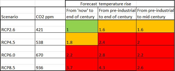
The basic concept is that of Representative Concentration Pathways (RCPs) which are expressed in terms of watts per square metre of radiative forcing (W m-2). So when looking at phenomena such as future temperature change or sea level rise there is no ‘business as usual’ (BAU) scenario. Four scenarios have been chosen – RCP2.6, RCP4.5, RCP6.0 and RCP8.5. These are described as, respectively, a mitigation scenario leading to a very low forcing level, two stabilisation scenarios and one scenario with very high greenhouse gas emissions. The last (RCP8.5) is perhaps the equivalent of BAU or a ‘no climate change policy’ scenario.
AR5 uses four time reference points, two past and two future – 1850-1900, 1986-2006, 2046-2065 and 2081-2100.
I have called 1850-1900 ‘pre-industrial’, while 1986-2005 is roughly ‘now’. It needs to be borne in mind that the 0.61C warming had already taken place from pre industrial times to 1986-2005. Looking forward 2046-2065 is ‘mid-century’ while 2080-2100 is roughly the end of the 21st century.
I’ve prepared a spreadsheet showing in the first column the prospective temperature rise from ‘now’ to the end of the 21st century. The second column adds in the warming from pre-industrial until ‘now’. Finally I’ve tabulated the increase from pre-industrial to mid-century. I’ve only quoted the mean values so that the signal doesn’t get lost in the noise.
Figure 1: RCP temperature scenarios
I’ve used green to indicate a comparatively ‘safe’ climate, orange to indicate the increasingly contested zone which clearly carries some danger, and red to indicate breaching the 2C guardrail which everyone with half a brain accepts as dangerous.
What needs to be emphasised here is the non-linearity of climate vulnerability and risk. As temperatures increase the potential for nasty surprises or ‘tipping points’ increases, but frankly we are already entering that zone.
Some points to note here. Firstly, the change from 1880 to 2012 (the real ‘now’) is given as 0.85C (0.65 to 1.06 with 90% certainty).
Secondly, while the CO2 levels are linked to certain watts per square metre in the RCPs the CO2 levels stand as a marker for all greenhouse gases. The RCPs don’t change if you additionally identify the MH4 and NO levels, as they are already included in the calculations.
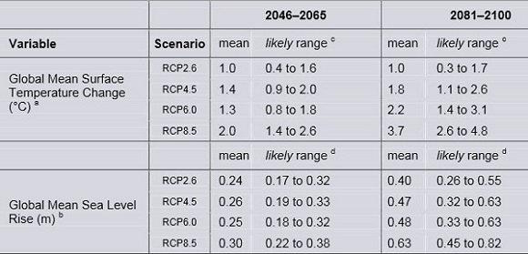
This table from the report shows the forecast temperatures, plus sea level rise, with uncertainty ranges.
Table 2: RCP scenarios for temperature and sea level rise___
The uncertainty range is a bit narrower than it was in AR4 in 2007. Please note, the text actually gives the range for RCP8.5 as 0.52 to 0.98m.
If we discard RCP2.6 because it won’t happen the total range of prospective sea level rise is 32cm to 82cm, with medium confidence. A linear extrapolation of the current rate of 3.2mm pa will yield the lower bound of that range. Also we are told:
Confidence in projections of global mean sea level rise has increased since the AR4 because of the improved physical understanding of the components of sea level, the improved agreement of process-based models with observations, and the inclusion of ice-sheet dynamical changes.
Furthermore:
Based on current understanding, only the collapse of marine-based sectors of the Antarctic ice sheet, if initiated, could cause global mean sea level to rise substantially above the likely range during the 21st century. However, there is medium confidence that this additional contribution would not exceed several tenths of a meter of sea level rise during the 21st century.
Under RCP8.5, however, the annual rate of change by 2100 will be from 8mm to 16mm, with a mean nearly four times the current rate. Apart from RCP2.6 sea level rise will continue in subsequent centuries.
RenewEconomy has a simple summary of the report, which includes this on precipitation:
Changes in the global water cycle in response to the warming over the 21st century will not be uniform. The contrast in precipitation between wet and dry regions and between wet and dry seasons will increase, although there may be regional exceptions.
Evidence for human influence has strengthened since AR4. It is now considered extremely likely (formerly very likely) that human influence has been the dominant cause of the observed warming since the mid-20th century. Moreover,
There is high confidence that changes in total solar irradiance have not contributed to the increase in global mean surface temperature over the period 1986 to 2008, based on direct satellite measurements of total solar irradiance.
Here’s the graph of radiative forcing:
Figure 1: Radiative forcing drivers___
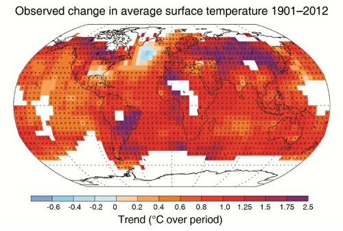
Here’s the historic graph for temperature rise, showing clearly that warming is still occurring:
Figure 2: Land and ocean surface temperature anomaly 1850-2012
Crisis or catastrophe – the climate budget crunch
Generally speaking, the 4C limit is said to be the point at which civilisation as we know it is threatened. Of relevance here, the AR5 document tells us that the near-complete melting of the Greenland ice sheet will occur, over a millennium or more, with a temperature rise of somewhere between 1C and 4C relative to pre-industrial.
The report still uses the guardrail of 2C temperature rise relative to 1861-1880 (Figure 2 shows that this would be similar to 1850-1900) in order to mark dangerous climate change. You’ll get plenty arguments about that. Bolivia, for example, wants to use 1C as the limit for a safe climate. In this post I noted that some developing countries sought a lower guardrail of 1.5C rather than 2C while the African civil society group Pan African Climate Justice Alliance (PACJA) wanted 1 to 1.5C.
David Spratt asks the question as to whether current levels of CO2 are already dangerous. His answer is unsettling, to say the least. What do our politicians think of the notion that we need to keep the temperature rise to less than 1.5C if we want to preserve more than 10% of corals worldwide?
He also found that during the Eemian 120,000 years ago we had three metres of sea level rise within 50 years with much gentler forcing than we have now, in probably the best analogue of what lies before us.
In a warming world what matters is the total quantum of CO2 in the atmosphere. The ‘climate budget approach’ identifies the total anthropogenic CO2 emitted to cause warming of 2C. For a 66% chance of staying under 2C the total CO2 emitted must not exceed 1000Gt, according to calculations done by Malte Meinshausen and others back in 2009. The later we leave cutting the harder we have to cut. Meinshausen’s article in Nature is paywalled, but this graph in an article by Stefan Rahmstorf (in German) gives the idea:
Rahmstorf’s text talks about 1000Gt of CO2 or about 1500GT of CO2 equivalent with other greenhouse gases for a 25% chance of staying within 2C. Forget the precise figures, it’s the pattern of peaking and subsequent reductions that matter.
Now, as Giles Parkinson reports, the carbon budget figures have taken a haircut to become 800Gt for a 66% chance of 2C when “accounting for non-CO2 forcings”. Problem is we’d already used up 543Gt of the budget by 2011.
Fiona Harvey at The Guardian tells us that the decision to put the numbers in the report was hard-won. There was concern they “would have political repercussions”. I think that was the intention!
Oliver Milman also at The Guardian, tells us that cuts of 10% per annum will now be necessary, though I can’t find that in the report. He doesn’t say from when. This graph, from the Climate Commission’s 2011 The Critical Decade report (the site is now down the crapper – my summary is here), shows 9% pa from 2020 for a 66% chance.
Figure 4: Emissions reduction options
I suspect the new 10% is from 2015 or 2017.
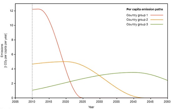
The above graph is sourced from a substantial 2009 document (in German) produced by WBGU (The German Advisory Council on Global Change) making the case for a carbon budget approach. Of more use to us is their English summary which on page 5 outlines the steps to be taken to provide an equitable way forward. The high polluting countries should take urgent steps to reduce emissions. Developing countries are then given space to increase emissions before reducing. The strategy is captured in this graph:
Figure 5: The climate budget approach
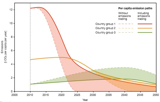
The red line represents the industrialised countries, green the developing countries. Newly industrialising countries such as China, Thailand and Mexico are represented by orange. With world-wide carbon trading (a world climate bank is proposed) the pattern would be varied along these lines:
Figure 6: The carbon budget approach with carbon trading
By 2100 all countries are allowed the same per capita emissions.
There is no doubt at all that the Germans and possibly the Europeans hoped for a deal along these lines from the UNFCCC meeting in Copenhagen in 2009. In the end a weak ‘contribute what suits you’ deal was cooked up in a small unofficial meeting that took place when President Obama went looking for his Chinese counterpart and found him ensconced with the leaders of India, Brazil, South Africa and others. The Europeans were not in the room. To say they were pissed off is an understatement. Nor was our man Rudd in the room, one of three leaders appointed to assist the Danish chair.
Now we have a deal to conclude a deal by 2015 within the UNFCCC framework, to be implemented from 2020. We’ve lost five years and the task is immensely harder.
Parkinson notes that our skinny remaining carbon budget means we can only afford to use about 10% of the world’s known fossil fuel reserves. But there is $4 trillion of shareholder value tied up in 200 listed companies in the industry carrying $1.5 trillion in loans. Writing down the value of that lot could break a few banks deemed too big to fail.
We’ve got a crisis for sure and a choice between two catastrophes.
It will be interesting to see what the mitigation working group comes up with. For my money, whatever they propose the Americans and the Chinese will not be pinned down to anything binding. In both cases their internal politics will not allow it.
The full WG1 report is now available. It’s 2126 pages long and they ask you not to quote it yet.
This was a repost and update of one I did in May 2009, Climate crunch which linked to a special edition of Nature where I think an early version of the Potsdam climate budget approach was outlined.
The post Suffer the little children told the story of what happened in Copenhagen and beyond.
In sum, the dynamics of the global coupled human-environmental system within the dominant culture precludes management for stable, sustainable pathways and promotes instability.
The quote was actually from the abstract of a sober, technical paper by geophysicist Brad Werner. The IPCC Fifth Assessment Report will also be sober and technical, based on peer reviewed literature, at least accepted for publication two to three months before the draft of each section is finalised, plus ‘grey’ material, which I take it means reliable sources such as government reports and reports prepared by or for organisations such as the International Energy Association, the World bank and our erstwhile Climate Commission.
There will be three working group reports, each with a summary for policymakers, plus a synthesis report. The working groups are:
WG1: The Physical Science Basis
WG2: Impacts, Adaptation and Vulnerability
WG3: Mitigation of Climate Change
It remains to be seen how urgent and dramatic the summaries for policymakers will be. The full import won’t be on view until the publication of WG3 in April next year, but the first should give us an idea of the seriousness of the situation.
The last Climate clippings was back in March 2012. I’ve decided to start it up again, so we’ll see how we go. What I try to do is to include up to eight entries with an average of no more than 125 words. Readers who want to keep up in a general way should be able to gain a basic understanding by reading the entries without following the links.
This time the entries blew out to an average of about 150 words.
Climate clippings also serves as an open thread to share interesting links.
1. Climate Consensus – the 97%
Announced at Skeptical Science as a new Guardian blog, John Abrahams and Dana Nuccitelli will be writing at Climate Consensus – the 97%. It does have comments, but to me is not formatted like a blog. Maybe a newspaper blog.
It really started on 24 April. So far it’s not high volume, but looks interesting. Nuccitelli blogs at Skeptical Science as dana1981. The new blog is targeted at a more general audience. It appears their output is going to include correcting the errors and myths of the climate change contrarians, which is welcome. Continue reading Climate clippings 72→
Climate change, sustainability, plus sundry other stuff


 Below I’ve set set out some of the main findings in the Summary for Policymakers (downloadable from