In this post I’ve included a series of explanatory images of the Antarctic in order to assist understanding the peril we are in from changes there, and why the Antarctic is going to be central to the climate change story over the coming centuries. What happens to the grandchildren of those who are children now is the big concern. In large part these images relate to items 2-4 of Climate clippings 96.
The first shows the giant vortex of winds, the strongest for at least 1000 years, ripping around Antarctica in a tight circle:
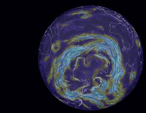
These winds draw rain away from southern Australia, and isolate Antarctica to some extent in terms of atmospheric warming. But they also churn up the ocean, leading to deeper mixing of heat and greenhouse gases.
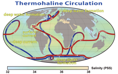
Both the deep and the shallow formations of the thermohaline circulation system wrap themselves around the Antarctic:
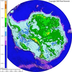
One way or another warm water is penetrating through to Antarctica. The underlying topography of Antarctica reveals much of the land lying below sea level:
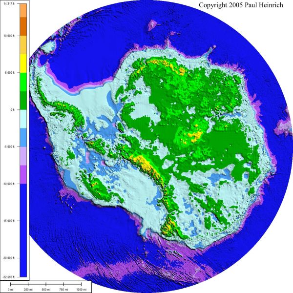
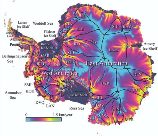
The borderline between blue and green marks sea level. Warmer water is coming directly into contact with the ice sheet and chewing away at the bottom of the ice shelves which form plugs holding up vast quantities of ice in the glaciers stretching hundreds of kilometres inland. The following image shows how the continent drains:
There is concern now that West Antarctica has tipped and with East Antarctica also more vulnerable than previously thought, sea level rise of some metres is now inevitable even if we were to somehow instantly curb greenhouse emissions.
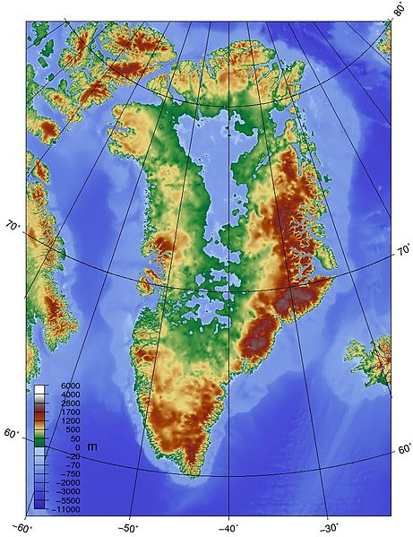
Greenland is quite a different problem. For starters the underlying topography is saucer shaped, with glaciers exiting to the sea through ‘gates’. This image shows the topography:
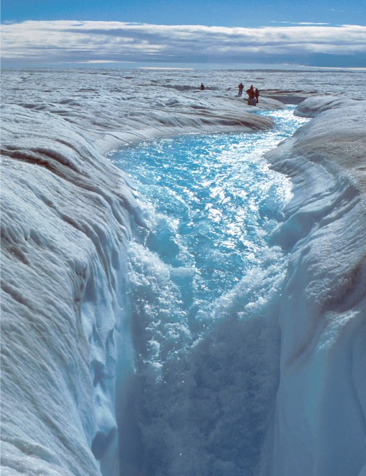
Greenland melts very much from the surface, so its largely a matter of meltwater penetrating, indeed plunging at times, through the surface to the rock below and glaciers speeding up. This image shows some people standing where I’d never stand:
This image shows melting covering the entire Greenland ice sheet for a few days in 2012:
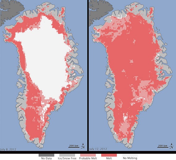
The panel on the left shows a more typical summer melt pattern, which is advancing noticeably over short time frames of a few years.
In the Antarctic, this image shows surface warming over the period 1981-2007:
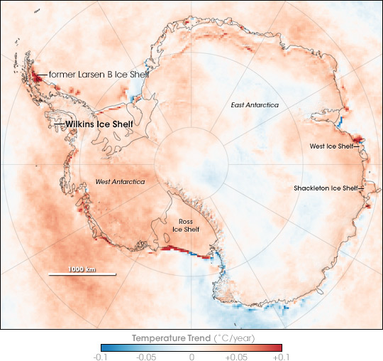
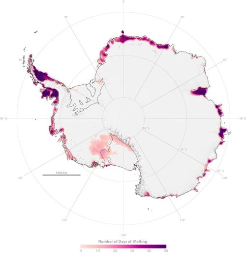
But with the average temperature around -39°C on the East Antarctic ice sheet, which is four kilometres high, that huge lump of ice is relatively stable. This image from NASA in 2005 shows significant perimeter surface melting around East Antarctica:
The new research sees concern that warmer sea waters may destabilise the ice further inland than previously thought. Match the red blobs on East Antarctica with the drainage map at Figure 4.
Of some some concern and some comfort is the Andrill Project which found that “the West Antarctic ice sheet has collapsed and regrown over 60 times in the past few million years”. This image shows what happened about a million years ago over a 12,000 year period:
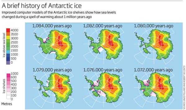
Concern because the Andrill research shows what can happen with mild orbital forcing (the Milankovitch cycles) as the main driver. I understand that CO2 concentration back then was only 400 to 450 ppm, which is where we now, implying that we are already committed to wasting the West Antarctica ice sheet. There is some comfort, however, that a change in the orbital forcing, which is far weaker than what we are doing now, arrested the melt in West Antarctica and brought the ice sheet back again. There was no tipping point which saw the whole East Antarctic sheet disappear.
For perspective I’ll post one of my favourites, a graph from David Archer in 2006 showing the broad relationship between temperature and sea level:
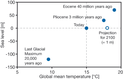
Do not connect the dots with straight lines. Most importantly, I think we now stand at the upper level of a 2°C interval where the sea level did not change much. The NH continental ice sheets had disappeared and the remaining ones – Antarctica, Greenland and the Arctic – were not seriously in play. Even now the main sources of sea level rise lie elsewhere. This table (13.1 from the IPCC5 WG1 Technical Summary) shows what’s happening:
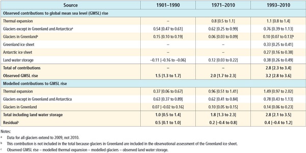
That’s hard to read, so here are the figures for the average annual expansion for 1993-2010:
-
Thermal expansion – 1.1mm
Glaciers except Greenland and Antarctica – 0.76mm
Glaciers in Greenland – 0.10mm
Greenland ice sheet – 0.33mm
Antarctic ice sheet – 0.27mm
With 4-5°C we can expect complete deglaciation and 75 to 80m sea level rise, made up of East Antarctica 59m, Greenland 6-7m, West Antarctica 5-6m, other glaciers and ice caps about 0.5m and thermal expansion, I don’t know, but I think in single figures. Greenland and Antarctica are accelerating rapidly and some time this century will become the top two contributors. These graphs from Skeptical Science are instructive:
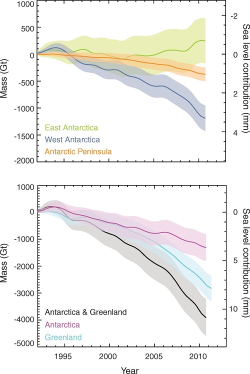
Greenland and West Antarctica are in a death spiral of accelerating ice sheet decay. It’s happened 60 or more time before in recent paleo history. West Antarctica, being more vulnerable may overtake Greenland.
One could say from this that East Antarctica is not yet in play, but science seems to suggest it is not far away.
When ice sheet decay gets going Hansen sees it as possibly progressing in geometric fashion, producing a curve like this:
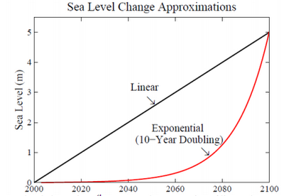
My thinking is that East Antarctica will tip sometime in the next decade, and that ice sheets will decay from there in a pattern that is more exponential than linear. Hansen’s scenario, which he puts forward as a serious possibility, does not look crazy.
I suspect that we are already committed to double digit sea level rise, and there’s not a thing we can do to prevent it; the question is when will it happen? We can only adapt and minimise.
I suspect also that things will go seriously pear-shaped during the latter part of this century. Pity our grandchildren’s grandchildren.
Update: There is a short ABC video news item about the Antarctic ice melt doubling since the last survey. At the end it says the process could take 1000 years. For a complete melt that would be lightning fast – 7.5 to 8 metres per century, or a metre every 12-13 years. We are pushing the system more than 10 times faster than it has ever been pushed before.
See also Gareth Renownden Goodbye coastline: we are beyond the point of no return.