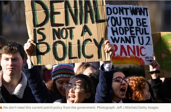
After a summer of record heat and wildfires, the Australian people along with business and industry are looking for concrete, responsible climate policies.
Business and consumer groups have accused Prime Minister Scott Morrison of “nakedly political pork barrelling” and “an egregious lack of process” over $3.5 billion in energy announcements.
“I’m greatly concerned about my future and the future of children all around the world who will suffer the consequences of climate change more than anyone else,” Marco said.
“A few days ago thousands of students from around Australia, like me, went on strike from school to demand that the Government acts on climate change.
“When will the Government start to care about my future and children around the world by acting on climate change and create a strong climate policy?”
There were three scams in the Government’s release of the latest quarterly update of the National Greenhouse Gas Inventory for March 2018.
The first, as reported by the ABC, FOI documents obtained by the Australian Conservation Foundation show that the Government sat on the report for seven weeks, then released it on 28 September, just before national football finals in the AFL and NRL, and amidst media preoccupation with the royal commission into banks.
That means the report was available to government from 10 August, fully two weeks before Malcolm Turnbull was turfed out on 24 August. Hence while political decisions were being made about the National Energy Guarantee, important information was being withheld.
Secondly, now the data is out, this is what the government wants us to concentrate on:
Tristan Edis at Climate Spectatormakes a valid point that insufficient attention has been given to the increase in mining emissions in our national inventory.
The two graphs displayed represent change in emissions. To provide context we really need to know the total quantum of emissions for each category. So I looked for the source of his graphs.
Turns out there is no one source. You have to go to this page. There is also a search facility here.
Edis has chosen his graphs well to make the points he makes, but some of the impressions may be misleading. Mining is the fastest growing sector but agriculture, residential and manufacturing are all still larger sectors. And residential in his graphs is only about half electricity consumption. The other half is mostly transport, but also includes emissions generated at residences, presumably mainly from gas. There are many messages you can dig out of the mine of information provided online. I’ll try to give a brief overview here.
Land use, land use change and forestry (LULUCF) activities are included.
The figure for electricity needs to be largely distributed across the other sectors. For example, the residential figure cited here would comprise only transport plus other emissions generated at homes.
Percentage change in direct and indirect emissions
The MtCO2e on the y-axis should have been omitted. Use of grid electricity is included in each sector. Agriculture is left out. It really should have been accompanied by Figure 6:
The graph that best captures everything happening now (at least in 2002-2010) is Figure 8 from the same document (p20). The graph is too big to reproduce here, so I’ve made this table:
Some thoughts.
Given the size of the electricity sector as a source and its potential in reducing emissions in the transport sector, clearly decarbonising electricity generation would go almost half way towards achieving zero emissions. Tackling electricity generation and transport represent the low-hanging fruit.
We have to ask whether an emissions trading system (ETS) by itself will achieve this in a time frame compatible with avoiding dangerous climate change. Recently I heard on Radio National that the fall in the demand for electricity is effectively locking in coal as a source of baseload power. If this article is correct we are spending $100 billion on a grid which will not be capable of handling diversified power generation.
This article is one of many detailing the falling electricity demand and some of the implications.
From the National Inventory by Economic Sector document, Figure 3 gives the direct emissions for each state:
Queensland would be the champion in per capita terms.
The Queensland LNP Government has decided to axe the policy and programs section of the Office of Climate Change. ‘Can-do’ can do whatever he wants!
Climate change, sustainability, plus sundry other stuff