
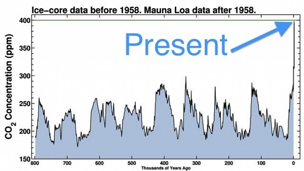
The third record year in a row has been declared. The last time it was as hot as this was 115,000 years ago. The last time CO2 was this high was in the Pliocene, 3 to 5 million years ago when the temperature became roughly 3 to 4 degrees Celsius warmer than today, and the sea level up to 40 metres higher.
Andrew Simms for The Guardian polled a number of scientists about whether we could keep warming under 2°C. Not a single one thought we would. One scientist said “not a cat in hell’s chance”. Kevin Anderson, now professor in Uppsala, said politically we gave up years ago. Prof Joachim Schellnhuber, director of the Potsdam Institute for Climate Impact Research, would “only confirm that it is still possible to keep global warming below 2C”. Technically speaking, I assume.
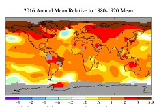
Here’s what it looks like:
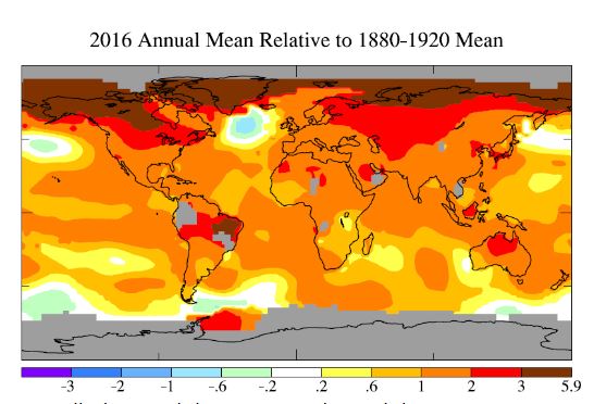
The cool blob below Greenland is still there, and is much more accentuated because on the 1890-1920 base, compared with the more usual 1950-1980 you often see. My post from last October Global temperature, the North Atlantic cold blob and the Gulf Stream gets a steady trickle of visitors. The concern over the slowing Gulf Stream and its impact on weather in Europe. I hope to return to the topic soon.
Most graphs don’t give a true anomaly from pre-industrial temperatures. I’ve gone to James Hansen, who is particular about such matters:
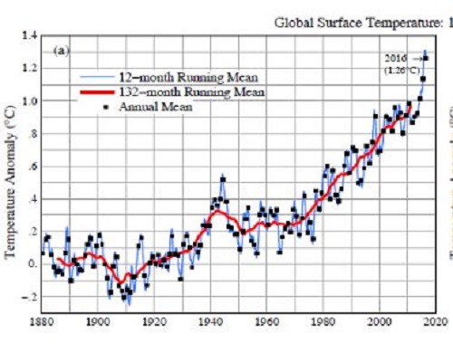
He uses:
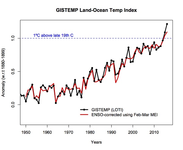
- Global surface temperatures relative to 1880-1920 based on GISTEMP data, which employs GHCN.v3 for meteorological stations, NOAA ERSST.v4 for sea surface temperature, and Antarctic research station data.
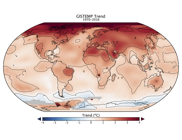
On his figures the anomaly is now 1.26°C. Some reports put it at 1.1°C, without saying what it was referenced to. Hansen also gives this breakdown by latitude regions:
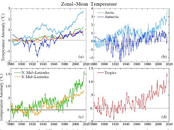
The Arctic is the runaway champ.
Gavin Schmidt thinks 2017 will be in the top five. Normally after a strong El Niño you get a La Niña with cooler temperatures. NASA points out:
- In 1997-98, very warm El Niño conditions persisted for roughly 13 months, but were then followed by roughly 32 months of well-below-normal (La Niña) water temperatures in the eastern Pacific. In 2015–2016, water temperatures and sea surface heights were above normal for 19 months, first weakly and then with great gusto in late 2015. But this event has been followed by just five months of weak La Niña conditions that are already fading.
They are expecting neutral conditions early in 2017.
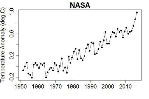
Tamino at Open Mind shows that we would have had a record even without an El Niño. This is his graph, from NASA, of the temperature since 1950:
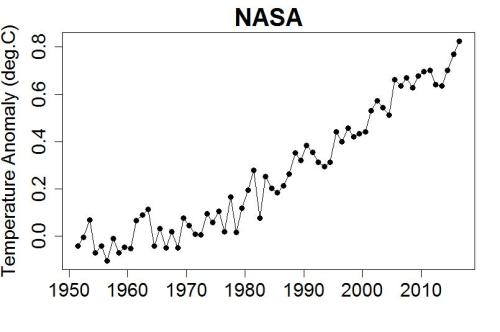
Here he statistically removes the effects of El Niño, volcanic eruptions, and solar variations:
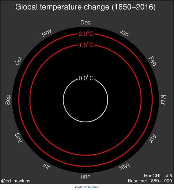
Climate Central have the clever animated spiral graph. This is a screen shot of the starting point in 1850:
This is what it looks like in 2016:
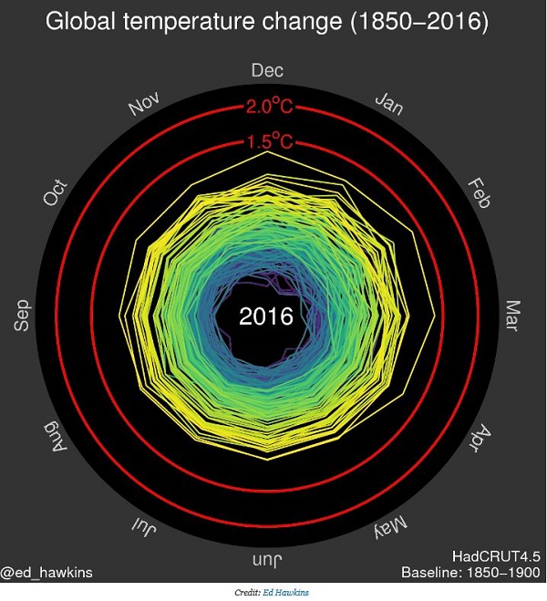
The yellow lines represent the 21st century.
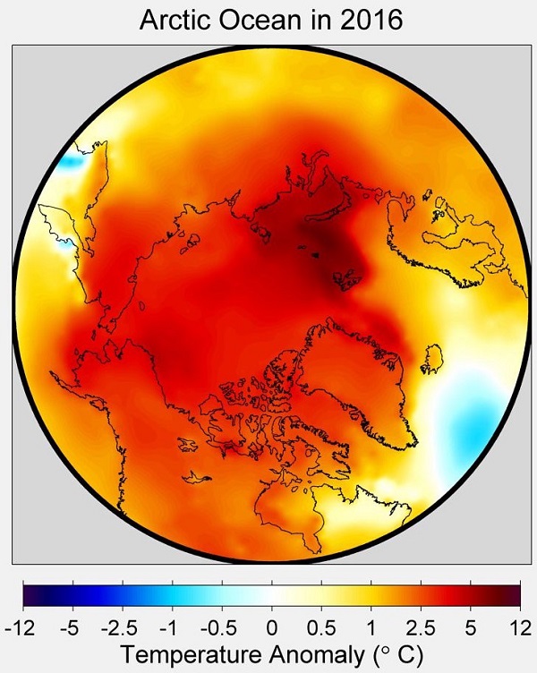
That was with HadCRUT data, which has no data for the Arctic where there are no weather stations. NASA, and I believe NOAA estimate the data. Since the Arctic is warming faster than elsewhere, the difference is starting to show. This image from Joe Romm at Think Progress shows the Arctic temperatures up to 12°C warmer than normal in 2016, whatever ‘normal’ was.
He also shows a map showing which countries had record temperatures:
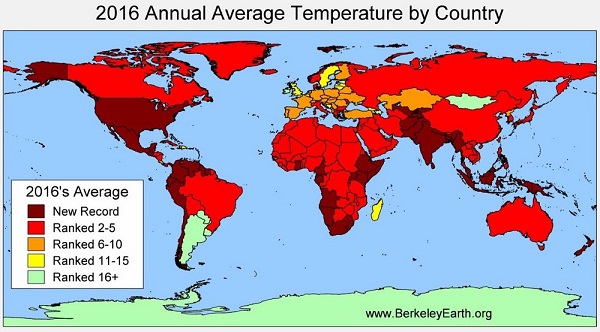
I believe Australia’s temperatures were the fourth highest on record. You can read all about us in the Climate Council’s report.
We did break the record for ocean temperatures around Australia which came in at 0.73 °C above average (1961-1990), making coral reef bleaching no surprise. Brisbane had the highest mean maximum temperature on record.
Climate Central also shows how the monthly temperatures compared in recent years:
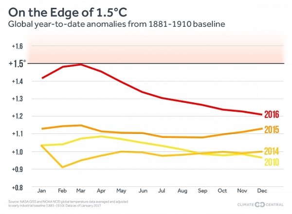
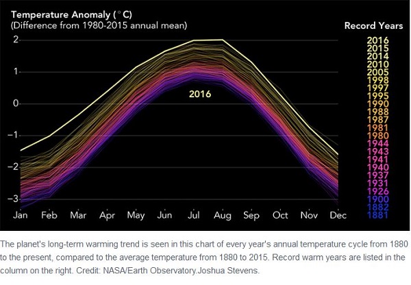
I must admit to being surprised by this one, as the monthly temperatures normally have a distinct bell curve to them, as this from NASA shows, which Climate Central reproduce in the same post:
Perhaps it shows the anomaly from each monthly average.
Finally, an image from Climate Central, back in 2013, as to what we’ve done with CO2 emissions in modern times:
It’s no wonder things are a bit out of whack.
Last year’s post was Too hot for comfort (or complacency).
Update: RealClimate now has a post by Gavin Schmidt with some points of interest.
Here’s his graph with the ENSO effect taken out:
Much the same as Tamino’s, which takes out a few other things as well. 2016 still would have been a record.
He says that the Arctic area overall has warmed by close to 4ºC above the late 19th Century, over 3 times as much as the global mean:
He says that leaving out the Arctic area as HadCRUT does is the same as assuming that the warming there is no more than the global average elsewhere. This is misleading.
I notice that the North Atlantic cool blob doesn’t show up so much on that graph, so it must be a fairly recent phenomenon.
Finally, he takes a look at the trend lines in relation to the ‘pause’:
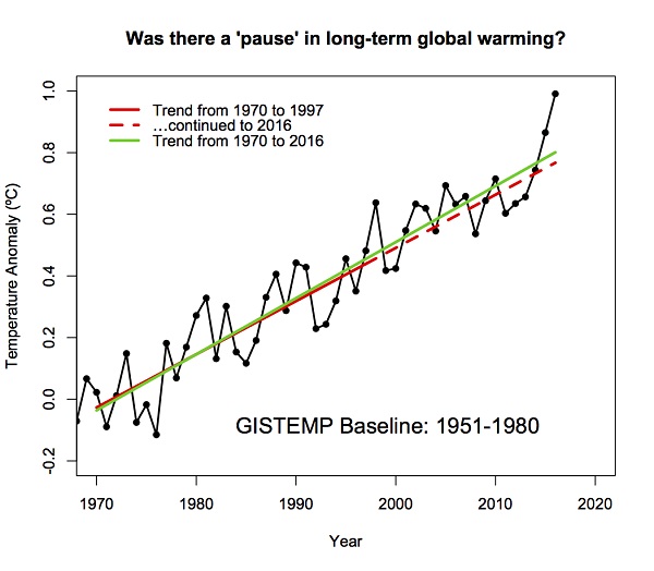
We can’t yet say that the trend is accelerating, but he says that may not be too far away.
When was your first Climate Clippings, Brian? Was it ten years ago? We were talking then about what could happen. Now it has happened. It is all just awful un news.
I think Turnbull and his “mob” (and Pauline Hanson for comic relief) need to get a copy of the first CC along with this one, with a tersely worded “please explain!!!”
CC probably about five years ago, but you are right. Things have gone downhill rapidly in the last 10 years.
Brian, just 5 years?? Wow. Compare your first CC reportings to the one you have just put up here and that is proof of climate change right there. What we thought would happen, and what actually happened, consolidates what we know will happen next.
Coral bleaching, a string of record hot years, polar ice at a record low for Dec….
And it is still OK to approve Adani and the Acland extension and elect right wing crazies who think it is all an illusion.
Yes, JohnD. It completely demolishes the notion that “the market knows best”, elections being a market place.
While Adani has received a green light, it may still stall at the traffic lights….. (lousy analogy)….. Driver might abandon the truck, bank might repossess the truck, …..
French company Engie is getting out of coal- fired power, worldwide. Whatever they know, will affect other corporations and lending institutions. Global financing implies rapid sharing of predictions, plans, risk estimates, and many of these affect investor behaviour.
Manufacturers of: solar panels, large-scale wind, large-scale solar, battery storage, electric vehicles, et cetera are growing in financial strength every day.
Large and small users of electric power and transport are making decisions favouring renewables, every week; both businesses and households.
My guess is, the Adani mine may never reach the exporting stage. But what would I know?
I’ve done an update from a post at RealClimate, so if I copy it in here all the images will show.
Update: RealClimate now has a post by Gavin Schmidt with some points of interest.
Here’s his graph with the ENSO effect taken out:
Much the same as Tamino’s, which takes out a few other things as well. 2016 still would have been a record.
He says that the Arctic area overall has warmed by close to 4ºC above the late 19th Century, over 3 times as much as the global mean:
He says that leaving out the Arctic area as HadCRUT does is the same as assuming that the warming there is no more than the global average elsewhere. This is misleading.
I notice that the North Atlantic cool blob doesn’t show up so much on that graph, so it must be a fairly recent phenomenon.
Finally, he takes a look at the trend lines in relation to the ‘pause’:
We can’t yet say that the trend is accelerating, but he says that may not be too far away.