
John D drew my attention to RenewEconomy’s Graph of the Day: Nine simple charts to explain the global carbon budget. The post was originally published at Shrink That Footprint. There’s been next to no discussion at either place, but in my experience site stats show that a lack of comments doesn’t necessarily mean a lack of readers.
The graphs all come from the Global Carbon Project’s Carbon Budget 2013, which you can download here.
Here’s my version of the story in eight slides.
Please note that CO2 emissions are quoted as gigatonnes of carbon. Each GtC = 3.664 GtCO2.
1. Carbon emissions are still rising
In 2012-13 carbon emissions from fossil fuels and cement rose by 2.1% as against 2.2% in 2011-12.

2. Emissions from coal continue to grow strongly
Emissions from coal grew at 2.8% as against gas and cement at 2.5% and oil at 1.2%.

Shares of fossil fuel emissions are now coal 43%, oil 33%, gas 18% and cement 5%. Flaring at 1% is not shown. Continue reading Simple graphs tell a big story
 These posts are intended to share information and ideas about climate change and hence act as a roundtable. Again, I do not want to spend time in comments rehashing whether human activity causes climate change.
 My attention was drawn to a series of articles under the heading The Meltdown by Peter Hartcher by Mark and then
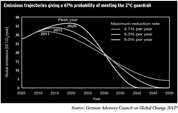
  Last month the Climate Change Authority published a Draft Report of its
 Over the last few days we’ve received a stream of information and images about cyclone* Haiyan which devastated central Philippines, especially the city of Tacloban. Zoe Daniels compiled
