
We’ve only just seen that statistically there never was a recent ‘pause’ or ‘hiatus’ in warming when two articles show up explaining the pause that wasn’t. A key word here is statistically. No-one is suggesting that there may not be variations from time to time that do not breach the trend.
Also climatologists are always interested in understanding the physical mechanisms behind both short-term variability and longer term trends.
First, via Carbon Brief there has been a new study examining the impact of aerosols from volcanoes.
Virtually all research into the climate influence of volcanic aerosols has used satellite measurements of particulates in the upper atmosphere (the stratosphere). These satellite measurements only monitor the volcanic aerosol at heights of 15 km and above. The new paper by David Ridley and colleagues studied the amount of volcanic aerosols in portions of the stratosphere that lie below 15 km.
They found that 30 to 70% of aerosols from recent eruptions lodged below the 15 km mark. Further, these lower level aerosols had been responsible for significant cooling since 2000. Taken together with additional heat being stored in the deep oceans, the slowdown is “both fully accounted for and temporary.”
Estimated volcanic cooling from this source is not included in climate models.
A second study looks at the influence of Pacific winds on warming since the 1890s. They did this by analysing the chemical make-up of corals.
The coral record suggests, for example, that trade winds were weak between 1910 and 1940 when the Earth warmed by 0.4 degrees, and were strong from 1940 to 1970, during a period of relatively little increase in global temperatures.
Apparently the winds have been very strong since the turn of the century.
The winds in question are the trade winds that move tropical surface water from east to west. This two-dimensional image attempts to illustrate the complex pattern. Trade winds just north and south of the equator drive warm surface water westwards:
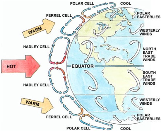
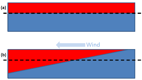
The water is replaced by cool water rising from the deep, which is known to affect global average surface temperatures. A simplified mechanism of how this works is given in the following:
Knowledge of the influence of the wind on temperature variations is not new. For example, Matthew England of the University of NSW and others published a paper early in 2014 on the subject. England says of the new paper:
“This is a really important study: it confirms the crucial role of the Pacific Ocean in driving decadal climate variability at a global scale.”
The strength of the trade winds is associated with a natural climate phenomenon called the Interdecadal Pacific Oscillation (IPO). The IPO has positive and negative phases, which switch every few decades. Lead author Professor Diane Thompson says:
“We do know that the typical lifetime of a phase of this cycle is less than 30 years, and the current one began about 15 years ago. So although the timing of that switch remains difficult to anticipate, it would be most likely to happen within the next one to two decades.”
We don’t know the future of volcanic activity, nor when the Pacific wind pattern is going to switch. What we do know is that both have been inhibiting warming in recent years.
Of course Pacific wind patterns are also associated with ENSO where El Niño years are warmer and La Niña years are cooler. A year ago Stefan Rahmstorf looked at The global temperature jigsaw where he identified a variety of influences at work. It included a graph from a 2012 paper which used a multivariate correlation analysis to take out the influence of ENSO, volcanoes and solar activity. The pink line shows observed data and the red line with those three factors removed:
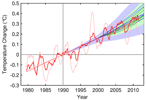
The ‘pause’ effectively goes away.
The observed data (pink line) in the above graph is an average of five data sets. It is likely that two of them, HadCRUT and NOAA omitted the Arctic entirely. I’ll post again the recent HadCRUT4 hybrid data from the satellite era which Rahmstorf suggests is now the best:
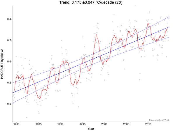
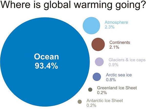
Again a pause is pretty hard to find, especially if you ignore 1998 as a outlier year. Of course 1998 should not be ignored as it appears to have had a crucial role in transferring stored heat from the ocean to the surface. It’s worth remembering just how little of the planet’s energy is stored on the surface compared to the ocean:
Rahmstorf did predict that when we had another El Niño year a new record would be set. 2014-15 is not an El Niño, not yet, but is being heralded as the warmest ever. I’ll wait for it to actually happen before reporting on it further. Meanwhile it’s a fair bet that we will have strong warming in the next few decades.


 These posts are intended to share information and ideas about climate change and hence act as a roundtable for readers to contribute items of interest. Again, I do not want to spend time in comments rehashing whether human activity causes climate change.
 These posts are intended to share information and ideas about climate change and hence act as an open thread. Again I do not want to spend time in comments rehashing whether human activity causes climate change.