CSIRO and the BOM have released their State of the Climate 2014 report. Pretty much the same story you’ve heard before, only a bit worse.
There’s a good summary at the special BOM site, where you can download the report. Other than that Climate Citizen has perhaps the best summary.
Graham Readfearn at Planet Oz riffs off the Dorothea Mackellar theme of a “sunburnt country” of “droughts and flooding rains”.
At Radio National’s PM Mark Colvin interviewed CSIRO’s Dr Penny Whetton.
At The Conversation Professor Neville Nicholls emphasises rising heatwaves and fires. Sophie Vorrath has more at RenewEconomy.
I’ll comment on a few sundry aspects.
Level of greenhouse gases
We are told that the global mean for CO2 in 2013 was 395 ppm, or “likely the highest level in at least 2 million years”. Back in the 2012 report the figure of 390 ppm for 2011 was described as “a level unprecedented in the past 800,000 years”. David Spratt at Climate Code Red added a corrective addendum “that should be 15 million years.”
Spratt referenced the work of Aradhna Tripati:
The last time carbon dioxide levels were apparently as high as they are today — and were sustained at those levels — global temperatures were 5 to 10 degrees Fahrenheit [DS: 3 to 6 degrees Celsius] higher than they are today, the sea level was approximately 75 to 120 feet [BB: 23 to 36 metres] higher than today, there was no permanent sea ice cap in the Arctic and very little ice on Antarctica and Greenland.
I’m amazed at how often these reports understate the gravity of the situation, presumably for fear of being written off as alarmist.
The report usefully adds the other main greenhouse gases to give a CO2 equivalence figure:
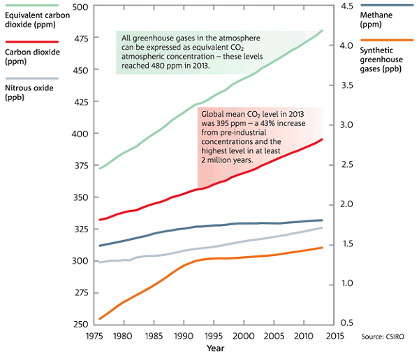
Please note the nitrous oxide and synthetic greenhouse gases are given in parts per billion.
In terms of CO2 equivalence we are now the 480 ppm. We should be red alerts everywhere and an emergency meeting of the G20, or something. The sad fact is that no policy agenda adopted by a political party has aspired to a safe climate. In fact the Garnaut Report and the Clean Energy Future Package legislated by Labor, the Greens and the indies, only ever aspired to 450 or 550 ppm CO2e. James Hansen in nominating 350 ppm as an initial target was very clear that this needed to assume net zero for the other greenhouse gases. What we are committed to now is a very unsafe climate as the effects play out in the short, mid and longer term.
Abbott was going to leave climate change off the forthcoming G20 agenda for Brisbane until the Americans complained.
Prospective temperature increases
Temperatures are projected to rise by 0.6 to 1.5°C by 2030 compared to the climate of 1980 to 1999. Warming by 2070 is projected to be 1.0 to 2.5°C for low greenhouse gas emissions and 2.2 to 5.0°C for high emissions.
We’ll achieve the upper bound if we continue as we are; the lower bound lacks credibility. To the ranges given we need to add 0.6°C in order to obtain the values for change since pre-industrial.
Again, we are clearly heading for dangerous climate change.
At time of writing there was a short piece in New Scientist citing three recent studies which indicate that climate sensitivity may have been under-estimated. Drew Shindell of NASA GISS:
“Sensitivity is not down at the low end,” Shindell says. “We can’t take any solace from warming being slower of late.”
That means we must cut our emissions fast, he says, or the planet could warm by 6°C by 2100.
Warming of 4°C is usually given as the level where civilisation as we know it comes into play. For Australia in a 4°C world, see Gabrielle Kuiper at Climate Code Red.
Hot days and heat waves
This graph shows the incidence of days in a year when the temperature is in the hottest 1% relative to 1910-2013:
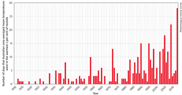
Graham Readfearn points out:
Starting from 1910 when Australia’s records start, it took 31 years for the country to rack up 28 days hot enough to fall into that top one per cent.
2013, however, managed to deliver this same number of extremely hot days in a single year.
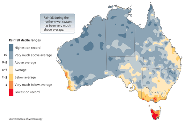
Precipitation changes
The following map shows the rainfall variation in deciles since 1995-1996 for the northern wet season of October to April:
The next map shows the rainfall variation in deciles since 1995-1996 for the southern wet season of April to November:
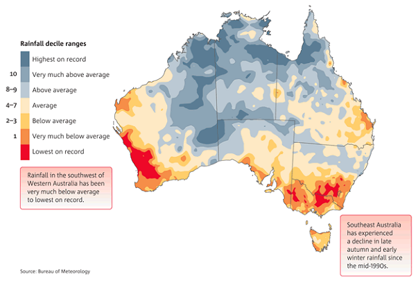
I believe that Sydney, which has dominant autumn/early winter rainfall, sits on the border between the summer and winter rainfall zones.
Clear patterns of change are becoming obvious. Apart from southern areas there is distinct drying in large tracts of Queensland, especially in winter.
This is disturbing:
The reduction in rainfall is amplified in streamflow in our rivers and streams. In the far southwest, streamflow has declined by more than 50 per cent since the mid-1970s. In the far southeast, streamflow during the 1997–2009 Millennium Drought was around half the long-term average.
Could be that we’ll increasingly have to rely on damaging floods to fill our dams.
Conclusion
There’s more, of course, including the prospect of losing our reef ecosystems.
Climate change is upon us.
I’m still like a rabbit out of Watership Down suffering frith (the state of paralysis a rabbit gets into at night when caught in car headlights as it crosses the road, IIRC).
It is unbelievable that Abbott didn’t want CC discussed at the G20 and was forced to put it on the agenda by the Americans.
I have thought for some time now that we have reached the tipping point and this report seems to confirm it.
The question is what can we do to mitigate it, and more importantly how can we do it when we have governments like Australia and Canada who refuse to believe in the reality of CC.
We are in the hands of madmen and madwomen it seems.
My grandchildren won’t have reached 50 by 2070
One wonders what “Tony the grandchildren hater” has against grandchildren? Or is it that he is confident that his descendants will be entitled to special treatment no matter how harsh the world becomes?
Precipitation changes:
From 1890 to 2013.
http://www.longpaddock.qld.gov.au/products/pdf/australiasvariablerainfall.pdf
Poor old Clive reckons it’s ‘naitcha’ causing global warming but as some wag over at Renew Economy pointed out, he only has to look in the mirror to see what the cumulative effects of adding 3% to a system previously in balance can do.
I think Clive already has his Titanic-the Galilee coal mine.
There seems to be a shift amongst deniers to admit the planet is warming but they stop short of engaging those few extra neurons to reason out the cause.
That temperature bar graph from 1910 is scary. It was even worse having to harvest apricots in that heat. We survived by wearing wet towels around our neck and minimised damage to the fruit on the tree by irrigating in the worst of the heat. Luckily there is no shortage of water ATM but in a year when water allocations are restricted another season of that sort of heat will be a disaster.
The season was a disaster in any case for many stone fruit growers due to a very warm winter. Varieties which require a chill factor simply didn’t set fruit. Some Adelaide Hills growers had virtually nothing to pick. Some apricot growers in the Riverland didn’t bother to pick as it would have cost them more to send pickers over it than the return.
Another really weird thing which could be sheeted home to global warming was the bird problem this season. Lorikeets and wattle birds came in droves, from where no one seems to know but it could have been because of widespread drought up north or from bushfires having destroyed their habitat. The problem extended from the Riverland all the way to the South East. One grower shot over 300 birds and still lost an entire variety. I shot over 200 and managed to limit losses to around $6000 including time wasted. In 25 years of growing apricots I have only had to shoot birds twice, this season and just a few the one before.
Can’t help with the birds, SG.
jumpy @ 3, there is too much detail in the individual maps in that link, but some very wet and dry years do stand out.
The wavy line at the bottom shows the overall trend which looks wetter in recent years. This is pointed out in the report. What that masks is a shift to wet in places where people don’t live and don’t much produce food. There is a curious diagonal strip in the maps in the post across western Qld and northern NSW.