Tag Archives: Hansen_James

Climate sensitivity and the myth of ‘burnable carbon’

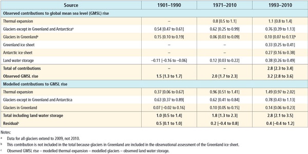
The ink is scarcely dry in the IPCC’s fifth report when it has become clear that they have badly underestimated the risks in two key areas – sea level rise and climate sensitivity. With respect to the latter, David Spratt at Climate Code Red comes to the conclusion that there is no carbon budget left, no ‘burnable carbon’ if we are looking for a safe climate.

As I said in Climate clippings 97 the fourth IPCC report in 2007 estimated that the planet will warm between 2 and 4.5°C warming in response to a doubling of the amount of CO2 in the atmosphere, with a best estimate of 3°C. This estimate was followed by a number of studies suggesting a lower sensitivity, leading the IPCC’s fifth report to extend the range to 1.5°C at the lower end and omit a best estimate entirely.

Back in May Dana Nuccitelli reported on a study by Kummer & Dessler which showed that recent studies suggesting an insensitive climate are flawed. They eliminate the lower part of the range but still converge on a value around 3°C.

Spratt now reports:

a recent paper by Sherwood, Bony et al looking at clouds and atmospheric convective mixing finds that on “the basis of the available data… the new understanding presented here pushes the likely long-term global warming towards the upper end of model ranges.” Taking “the available observations at face value,” they write, “implies a most likely climate sensitivity of about 4°C, with a lower limit of about 3°C.”

Problem is that these estimates are based on short-term feedbacks only, or what is known as Equilibrium Climate Sensitivity (ECS). Spratt says:

Paleoclimatology (study of past climates) suggests that if longer-term feedbacks of “slow” factors are taken into account, such as the decay of large ice sheets, changes in the carbon cycle (changed efficiency of carbon sinks such as permafrost and methane clathrate stores, as well as biosphere stores such as peatlands and forests), and changes in vegetation coverage and reflectivity (albedo), then the Earth’s sensitivity to a doubling of CO2 could itself be double that of the “fast” climate sensitivity predicted by most climate models, or around 6°C.

A measure of these effects for a doubling of CO2 is known as Earth System Sensitivity (ESS).

He says that “ESS is generally considered to come into play over periods from centuries to several millennia.”

If that’s how the earth system operates, that’s how we must operate.

Now in February 2013, new research on Russian cave formations measuring historic melting rates gives rise to a warning that a +1.5°C global rise in temperature compared to pre-industrial is enough to start a general permafrost melt.

Other research indicates that thaw and decay of permafrost carbon, once seriously started, is irreversible.

Rather than 2°C as a guardrail to avoid dangerous climate change, we must expect danger to occur at 1.5°C.

We are pushing the climate harder than it has been pushed in the last 65 million years. In this post I asked what does 4°C mean?

Professor John Schellnhuber, Director of the Potsdam Institute for Climate Impact Research, provides a stark assessment of the difference between a rise of two and four degrees. ‘The difference,’ he says, ‘is human civilisation. A 4°C temperature increase probably means a global [population] carrying capacity below 1 billion people’.

For a safe climate as we saw in The game is up, again quoting David Spratt:

We have to come to terms with two key facts: practically speaking, there is no longer a “carbon budget” for burning fossil fuels while still achieving a two-degree Celsius (2°C) future; and the 2°C cap is now known to be dangerously too high.

I hate to say this, but at the leading edge people are catching up with what James Hansen was saying back in 2008. Here’s a table from page 17 of the 2011 paper Earth’s Energy Imbalance and Implications where he gives four categories of climate sensitivity:

Climate sensitivity_cropped_600

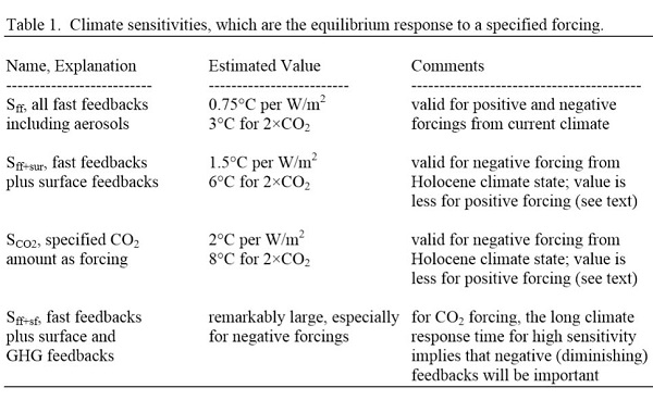
The fourth doesn’t bear thinking about. Clearly he’s a dangerous man and needs to be locked up.

Activist_cropped

Antarctic images

In this post I’ve included a series of explanatory images of the Antarctic in order to assist understanding the peril we are in from changes there, and why the Antarctic is going to be central to the climate change story over the coming centuries. What happens to the grandchildren of those who are children now is the big concern. In large part these images relate to items 2-4 of Climate clippings 96.

The first shows the giant vortex of winds, the strongest for at least 1000 years, ripping around Antarctica in a tight circle:

Figure 1
Figure 1

These winds draw rain away from southern Australia, and isolate Antarctica to some extent in terms of atmospheric warming. But they also churn up the ocean, leading to deeper mixing of heat and greenhouse gases.

Both the deep and the shallow formations of the thermohaline circulation system wrap themselves around the Antarctic:

Figure 2
Figure 2

One way or another warm water is penetrating through to Antarctica. The underlying topography of Antarctica reveals much of the land lying below sea level:

Figure 3
Figure 3

The borderline between blue and green marks sea level. Warmer water is coming directly into contact with the ice sheet and chewing away at the bottom of the ice shelves which form plugs holding up vast quantities of ice in the glaciers stretching hundreds of kilometres inland. The following image shows how the continent drains:

Figure 4
Figure 4

There is concern now that West Antarctica has tipped and with East Antarctica also more vulnerable than previously thought, sea level rise of some metres is now inevitable even if we were to somehow instantly curb greenhouse emissions.

Greenland is quite a different problem. For starters the underlying topography is saucer shaped, with glaciers exiting to the sea through ‘gates’. This image shows the topography:

Figure 5
Figure 5

Greenland melts very much from the surface, so its largely a matter of meltwater penetrating, indeed plunging at times, through the surface to the rock below and glaciers speeding up. This image shows some people standing where I’d never stand:

Figure 6
Figure 6

This image shows melting covering the entire Greenland ice sheet for a few days in 2012:

Figure 7
Figure 7

The panel on the left shows a more typical summer melt pattern, which is advancing noticeably over short time frames of a few years.

In the Antarctic, this image shows surface warming over the period 1981-2007:

Figure 8
Figure 8

But with the average temperature around -39°C on the East Antarctic ice sheet, which is four kilometres high, that huge lump of ice is relatively stable. This image from NASA in 2005 shows significant perimeter surface melting around East Antarctica:

Figure 9
Figure 9

The new research sees concern that warmer sea waters may destabilise the ice further inland than previously thought. Match the red blobs on East Antarctica with the drainage map at Figure 4.

Of some some concern and some comfort is the Andrill Project which found that “the West Antarctic ice sheet has collapsed and regrown over 60 times in the past few million years”. This image shows what happened about a million years ago over a 12,000 year period:

Figure 10
Figure 10

Concern because the Andrill research shows what can happen with mild orbital forcing (the Milankovitch cycles) as the main driver. I understand that CO2 concentration back then was only 400 to 450 ppm, which is where we now, implying that we are already committed to wasting the West Antarctica ice sheet. There is some comfort, however, that a change in the orbital forcing, which is far weaker than what we are doing now, arrested the melt in West Antarctica and brought the ice sheet back again. There was no tipping point which saw the whole East Antarctic sheet disappear.

For perspective I’ll post one of my favourites, a graph from David Archer in 2006 showing the broad relationship between temperature and sea level:

Figure 11
Figure 11

Do not connect the dots with straight lines. Most importantly, I think we now stand at the upper level of a 2°C interval where the sea level did not change much. The NH continental ice sheets had disappeared and the remaining ones – Antarctica, Greenland and the Arctic – were not seriously in play. Even now the main sources of sea level rise lie elsewhere. This table (13.1 from the IPCC5 WG1 Technical Summary) shows what’s happening:

Figure 12
Figure 12

That’s hard to read, so here are the figures for the average annual expansion for 1993-2010:

    Thermal expansion – 1.1mm

    Glaciers except Greenland and Antarctica – 0.76mm

    Glaciers in Greenland – 0.10mm

    Greenland ice sheet – 0.33mm

    Antarctic ice sheet – 0.27mm

With 4-5°C we can expect complete deglaciation and 75 to 80m sea level rise, made up of East Antarctica 59m, Greenland 6-7m, West Antarctica 5-6m, other glaciers and ice caps about 0.5m and thermal expansion, I don’t know, but I think in single figures. Greenland and Antarctica are accelerating rapidly and some time this century will become the top two contributors. These graphs from Skeptical Science are instructive:

Figure 13
Figure 13

Greenland and West Antarctica are in a death spiral of accelerating ice sheet decay. It’s happened 60 or more time before in recent paleo history. West Antarctica, being more vulnerable may overtake Greenland.

One could say from this that East Antarctica is not yet in play, but science seems to suggest it is not far away.

When ice sheet decay gets going Hansen sees it as possibly progressing in geometric fashion, producing a curve like this:

Figure 14
Figure 14

My thinking is that East Antarctica will tip sometime in the next decade, and that ice sheets will decay from there in a pattern that is more exponential than linear. Hansen’s scenario, which he puts forward as a serious possibility, does not look crazy.

I suspect that we are already committed to double digit sea level rise, and there’s not a thing we can do to prevent it; the question is when will it happen? We can only adapt and minimise.

I suspect also that things will go seriously pear-shaped during the latter part of this century. Pity our grandchildren’s grandchildren.

Update: There is a short ABC video news item about the Antarctic ice melt doubling since the last survey. At the end it says the process could take 1000 years. For a complete melt that would be lightning fast – 7.5 to 8 metres per century, or a metre every 12-13 years. We are pushing the system more than 10 times faster than it has ever been pushed before.

See also Gareth Renownden Goodbye coastline: we are beyond the point of no return.

State of the Climate, 2014

Front page_cropped

CSIRO and the BOM have released their State of the Climate 2014 report. Pretty much the same story you’ve heard before, only a bit worse.

There’s a good summary at the special BOM site, where you can download the report. Other than that Climate Citizen has perhaps the best summary.

Graham Readfearn at Planet Oz riffs off the Dorothea Mackellar theme of a “sunburnt country” of “droughts and flooding rains”.

At Radio National’s PM Mark Colvin interviewed CSIRO’s Dr Penny Whetton.

At The Conversation Professor Neville Nicholls emphasises rising heatwaves and fires. Sophie Vorrath has more at RenewEconomy.

I’ll comment on a few sundry aspects.

Level of greenhouse gases

We are told that the global mean for CO2 in 2013 was 395 ppm, or “likely the highest level in at least 2 million years”. Back in the 2012 report the figure of 390 ppm for 2011 was described as “a level unprecedented in the past 800,000 years”. David Spratt at Climate Code Red added a corrective addendum “that should be 15 million years.”

Spratt referenced the work of Aradhna Tripati:

The last time carbon dioxide levels were apparently as high as they are today — and were sustained at those levels — global temperatures were 5 to 10 degrees Fahrenheit [DS: 3 to 6 degrees Celsius] higher than they are today, the sea level was approximately 75 to 120 feet [BB: 23 to 36 metres] higher than today, there was no permanent sea ice cap in the Arctic and very little ice on Antarctica and Greenland.

I’m amazed at how often these reports understate the gravity of the situation, presumably for fear of being written off as alarmist.

The report usefully adds the other main greenhouse gases to give a CO2 equivalence figure:

fig13_600

Please note the nitrous oxide and synthetic greenhouse gases are given in parts per billion.

In terms of CO2 equivalence we are now the 480 ppm. We should be red alerts everywhere and an emergency meeting of the G20, or something. The sad fact is that no policy agenda adopted by a political party has aspired to a safe climate. In fact the Garnaut Report and the Clean Energy Future Package legislated by Labor, the Greens and the indies, only ever aspired to 450 or 550 ppm CO2e. James Hansen in nominating 350 ppm as an initial target was very clear that this needed to assume net zero for the other greenhouse gases. What we are committed to now is a very unsafe climate as the effects play out in the short, mid and longer term.

Abbott was going to leave climate change off the forthcoming G20 agenda for Brisbane until the Americans complained.

Prospective temperature increases

Temperatures are projected to rise by 0.6 to 1.5°C by 2030 compared to the climate of 1980 to 1999. Warming by 2070 is projected to be 1.0 to 2.5°C for low greenhouse gas emissions and 2.2 to 5.0°C for high emissions.

We’ll achieve the upper bound if we continue as we are; the lower bound lacks credibility. To the ranges given we need to add 0.6°C in order to obtain the values for change since pre-industrial.

Again, we are clearly heading for dangerous climate change.

At time of writing there was a short piece in New Scientist citing three recent studies which indicate that climate sensitivity may have been under-estimated. Drew Shindell of NASA GISS:

“Sensitivity is not down at the low end,” Shindell says. “We can’t take any solace from warming being slower of late.”

That means we must cut our emissions fast, he says, or the planet could warm by 6°C by 2100.

Warming of 4°C is usually given as the level where civilisation as we know it comes into play. For Australia in a 4°C world, see Gabrielle Kuiper at Climate Code Red.

Hot days and heat waves

This graph shows the incidence of days in a year when the temperature is in the hottest 1% relative to 1910-2013:

fig7_600

Graham Readfearn points out:

Starting from 1910 when Australia’s records start, it took 31 years for the country to rack up 28 days hot enough to fall into that top one per cent.

2013, however, managed to deliver this same number of extremely hot days in a single year.

Precipitation changes

The following map shows the rainfall variation in deciles since 1995-1996 for the northern wet season of October to April:

fig5_600

The next map shows the rainfall variation in deciles since 1995-1996 for the southern wet season of April to November:

fig6_600

I believe that Sydney, which has dominant autumn/early winter rainfall, sits on the border between the summer and winter rainfall zones.

Clear patterns of change are becoming obvious. Apart from southern areas there is distinct drying in large tracts of Queensland, especially in winter.

This is disturbing:

The reduction in rainfall is amplified in streamflow in our rivers and streams. In the far southwest, streamflow has declined by more than 50 per cent since the mid-1970s. In the far southeast, streamflow during the 1997–2009 Millennium Drought was around half the long-term average.

Could be that we’ll increasingly have to rely on damaging floods to fill our dams.

Conclusion

There’s more, of course, including the prospect of losing our reef ecosystems.

Climate change is upon us.

Assessing dangerous climate change

Seventeen high-profile academics with expertise across the climate research spectrum, from atmospheric science, earth science and environmental science, to economics, global change and public health led by James Hansen, now at Columbia University’s Earth Institute, have published a paper Assessing “Dangerous Climate Change”: Required Reduction of Carbon Emissions to Protect Young People, Future Generations and Nature which demands attention.

The bottom line is that “aiming for the 2°C pathway would be foolhardy” because it “would have consequences that can be described as disastrous”. The authors believe that humanity and nature, the modern world as we know it, is adapted to the Holocene climate that has existed more than 10,000 years. Departing from this climate by more than 1°C would have intrinsically harmful effects. At 2°C these effects become unacceptably severe. Moreover we enter a zone where further feedbacks, such as ice sheet response, methane release and vegetation change, are likely to push the climate towards further warming, of probably at least 3°C.

James Hansen and Pushker Kharecha have done a summary with discussion here, then there’s Joe Romm at Climate Progress, Tim Radford at Climate Code Red, Damian Pattinson, Editorial Director, PLOS ONE and at Huff Post. My partial summary is below. Continue reading Assessing dangerous climate change

Hansen retires to embrace activism

Activist_cropped

We are going to see more images like the one on the left, it seems. I picked up the news from a Google feed to this article at mother nature network. Climate scientist James Hansen has retired at the age of 72 from NASA GISS in order to concentrate on activism. The scoop was claimed by the New York Times. Climate Progress quickly picked up on the story.

Hansen first made a splash with an article with six other scientists in 1981. After his testimony to Congress in 1988 he retired from public advocacy and communication for about 15 years, concentrating on the science and his administrative role at NASA GISS, to become publicly active again from about 2003.

NASA’s press release on his retirement emphasises that his research was closely aligned with:

the development of increasingly sophisticated satellite platform measurements, such as the terrestrial radiation budget, ozone and weather-related data, and the need for increasingly sophisticated atmospheric models to assess and evaluate the information content and utility of these measurements.

Also the use of models to make climate change predictions for the future. Continue reading Hansen retires to embrace activism