Tag Archives: Paleoclimate

Where will we be in 250 million years time?

A bit longer than 250 million years is when we had the Great Dying, the Permian–Triassic extinction event, when up to 96% of all marine species and 70% of terrestrial vertebrate species became extinct. A mere 65 million years ago saw the extinction of the dinosaurs and the dawn of the Cainozoic Era. From a screenshot of this YouTube, this is how the continents were placed around the globe:

Continue reading Where will we be in 250 million years time?

Climate clippings 126

1. New research reveals extreme oxygen loss in oceans during past climate change

New research published this week reveals that vast stretches of the ocean interior abruptly lost oxygen during the transition out of the last ice age that occurred 17,000–10,000 years ago.

If that happened as a result of the relatively gentle forcing caused by changes in the Earth’s orbit, imagine what is possible now!

Like most of the life on the planet, the large majority of marine organisms need oxygen to live. Most marine life, from salmon, crabs, to shellfish, respires oxygen and many forms are intolerant of low oxygen seawater.

So-called ‘dead zones’ do contain life comprised of worms, bacteria, specialized urchins and bivalves, and other extremophiles, just not the kind of tucker we like to eat.

2. India ‘walking the talk’ on climate change

India is one country a bit allergic to discussing agriculture and climate pollution. They worry about feeding the millions. They also got a serve from Obama when he was there:

During a visit to New Delhi last month, Obama warned that the world does not “stand a chance against climate change” unless developing countries such as India reduce their dependence on fossil fuels.

India, as usual, is impervious to pressure, but the environment minister reckons they are doing their bit. New prime minister Narendra Modi is keen on renewable energy:

Since coming to power in May, Modi has pledged to increase India’s renewable energy in a bid to lower coal use and bring electricity to more than 300 million poor people currently without power.

Modi, who built up a solar industry in Gujarat state when he was chief minister, has set a target for India to have 100 gigawatts of solar capacity by 2022.

3. Abbott’s decline attributed to G20 Obama snub and climate change

On Newspoll Abbott’s net approval rating is now -44 (68% disapprove, 24% approve of how he is doing his job). Jason Wison says:

After a polling mini-recovery of sorts for Abbott between July and September, November – the month of the G20 and Obama’s address – marked a turning-point. Between September and November, Abbott’s always-poor net satisfaction ratings had improved and stabilised a little; from November they declined rapidly to where they are today. In some polls, Abbott now has more than half the voters saying that he should resign. November was also the month in which Bill Shorten decisively overcame Abbott as preferred prime minister, and Shorten’s lead is now wider than ever.

Wilson reminds us that Abbott refused to accept President Obama’s request to put climate change on the G20 agenda. Obama’s response was to kick off his stay with an address at the University of Queensland embarrassing Abbott with his references to Australia and climate change.

4. Maurice Newman wrongly claimed a UK charity had blamed the deaths of elderly people on renewable energy policies

Maurice Newman is of course Tony Abbott’s top science advisor. Graham Readfearn investigated his claim and found:

Newman is not only misrepresenting the charity’s position, he appears to be making up positions that the charity simply does not hold.

Also:

between 2004 and 2011 the average annual energy bill in the UK went up from £610 to £970.

Only £30 of that £360 increase was due to costs related to low-carbon power generation.

Most of the increase, the analysis said, was down to higher gas prices and network costs (maintaining poles and wires).

In my view, Newman’s attempt to pin the blame for the deaths of UK pensioners on renewable energy policies is either disgustingly dishonest or pathetically sloppy.

In the rest of the article Readfearn gives an explainer on how world surface temperature is measured.

5. Miocene temperatures

This Skeptical Science post gives a detailed account of what happened 14 to 17 million years ago in the “Mid Miocene Climate Optimum” (MMCO):

The MMCO was ushered in by CO2 levels jumping abruptly from around 400ppm to 500ppm, with global temperatures warming by about 4°C and sea levels rising about 40m (130 feet) as the Antarctic ice sheet declined substantially and suddenly.

Over the succeeding 2-3 million years Antarctic ice fluctuated dynamically in response to orbital wobbles, showing it was balanced on a knife-edge between a world with little ice and a world with substantial ice caps. Ice-free parts of Antarctica were rain-drenched and supported lush vegetation, while Arctic land was covered by temperate forests. Parts of the planet that had been arid before the MMCO rapidly re-greened and reforested (eg Patagonia).

This graph plots temperature and CO2:

Miocene_cropped_600

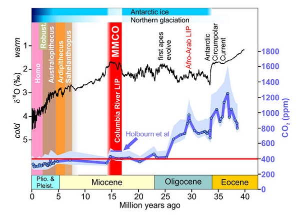
There were some differences between then and now. The Isthmus of Panama had not closed, for example. The warming happened on a warmer base.

Our warming is about 1000 times faster, giving less time for ecosystems to adapt. This is problematic for ocean acidification inter alia.

You’ve been warned!

I did have a restful Christmas, albeit wrapped in the warmth of Brisbane’s humidity, but in the still of the night reality has a way of breaking through. I’ll begin with the ending of this story, as it were, by quoting what Carl Sagan said about the photograph of Earth taken from Voyager 1 as it left the Solar System:

That’s here. That’s home. That’s us. On it everyone you know, everyone you love, everyone you’ve ever heard of, every human being who ever was, lived out their lives … Our planet is a lonely speck in the great enveloping cosmic dark. In our obscurity — in all this vastness — there is no hint that help will come from elsewhere to save us from ourselves.

Here’s the pic:

Voyager pic_4wq9db2n-1368400770_500

That’s from a article by Andrew Glikson done back in May as CO2 levels in the atmosphere of 400 parts per million were recorded by the National Oceanic and Atmospheric Administration.

Glikson highlights the changes this implies when the full effects become apparent, according to the paleo record when CO2 levels were similar in the Pliocene: Continue reading You’ve been warned!

CO2 hits 400 ppm

On May 9 CO2 reached 400 ppm at the National Oceanic and Atmospheric Administration’s (NOAA) monitoring centre at Muana Loa and at at the Scripps Institution of Oceanography in San Diego, California. This is what’s been happening over the last 130 years in broad terms:

co2-temp_570

It seems many news organisations, for example the BBC, and some scientists are stressing that the last time concentrations were so high was 3 to 5 million years ago. In the linked article Michael Mann, director of the Earth System Science Center at Penn State gives a different view:

Mann said the last time scientists are confident that CO2 was sustained at the current levels was more than 10 million years ago, during the middle of the Miocene Period. Continue reading CO2 hits 400 ppm

Climate clippings 73

In this edition I’ve stuck to scientific articles, and, incidentally have used a couple (items 3 and 4) from stuff I gathered around this time last year when I thought I might be launching a new blog. For reasons we won’t go into it didn’t happen at that time.

1. Arctic ice watch

While we were on sabbatical last year the northern cryosphere had an exciting time. There was a giant storm in the Arctic ocean, Greenland surface melt covered virtually the whole ice sheet and all sorts of records were broken in the Arctic summer sea ice melt. I’m hoping to do an update to catch us up, but follow this link to see a dramatic animation of Arctic sea ice volume loss since 1979. I’ve posted this image to show how far we’ve come:

volume-comparison-1979-2012-v4

You can monitor Arctic sea ice extent on the NSIDC site. This image is a screenshot from the interactive graph on that page showing the way summer sea ice is sagging:

Sea ice extent_cropped_580 Continue reading Climate clippings 73

Climate clippings 71

1. State of the climate 2012

BOM amd the CSIRO have produced the State of the Climate – 2012 report. BOM has a handy summary summary and link to the brochure. The CSIRO site has some added interviews. I’ve extracted two images. First is the relentless increase in ocean heat content:

Ocean heat content

Second is the rainfall pattern for April to September from 1997 to 2011:

Rainfall April to September, 1997-2011

According to the report we can expect the same only more so in the future.

See also The Conversation. Continue reading Climate clippings 71

Climate clippings 52

7 billion and counting

With the world’s population passing 7 billion there have been reports and analysis all over the media.

George Monbiot, clear-headed as usual, says the real problem is consumption. He also takes a look at the UN calculations, and is not impressed, but one way or another the graph is going to go up for about four decades.

Fred Pearce is not an economist, but he may have a point in saying that ageing is the trend and with that your economy goes down the tube. Japan has become the land of the setting sun.

Those two are part of The Guardian’s Crowded Planet series. Our ABC has 7 challenges for 7 billion put together by 7 academics. Continue reading Climate clippings 52

Climate clippings 44

Giant red crabs invade the Antarctic abyss

From the New Scientist via Huffington Post “Huge crabs more than a metre across have invaded the Antarctic abyss, wiped out the local wildlife and now threaten to ruin ecosystems that have evolved over 14 million years.”

These critters occupy a layer between 1400 and 950 metres deep, where the water is a little warmer. Further up the water is cooled by melting ice.

Global warming seems to be the culprit. Back in 1982 the minimum temperature there was 1.2°C, too cold for king crabs. Last year it had risen to a balmy 1.47°C, enough for the crabs to thrive.

The temperature rise at 0.27°C is not large, but I suspect it takes a lot of energy to produce it. Continue reading Climate clippings 44

Climate clippings 39

Greenland ice

Predicting tipping points

Tim Lenton is now attempting to link the basic theory of climatic “tipping points” with observed early warning signals.

Problem is, these tipping points may not be sudden and dramatic but involve a steady but inevitable increase. When outbreaks of pine beetles first became obvious perhaps the eventual destruction of Canada’s boreal forests was inevitable. But Lenton is making an argument “from almost a mathematical point of view” that there are general properties of tipping points. Continue reading Climate clippings 39

Climate clippings 34

Mt Pinatubo

Volcanic CO2

Open Mind tells us that even earth scientists outside the field of volcanology don’t know how much CO2 volcanoes emit. Claims are made that it dwarfs human activity and that Mt Pinatubo emitted more than humans in the history of the world.

The answer is that it’s probably less than 1% and that we emit in half a day the equivalent of the Mt Pinatubo event. Continue reading Climate clippings 34

Climate clippings 33

Stormy weather

2010 possibly the worst ever for extreme weather

That’s according to über-meteorologist Jeff Masters posting at Climate Progress.

The year was extraordinary, featuring the hottest year on record equalling 2005, the most extreme winter Arctic atmospheric circulation on record, the warmest and driest winter on record for North America-Canada, the lowest volume of Arctic sea ice on record and 3rd lowest in extent, a record melting in Greenland, the second most extreme shift from El Niño to La Niña, the second worst coral bleaching year, the wettest year over land, the Amazon rainforest experienced its 2nd 100-year drought in 5 years and, it must be said, we had the lowest global tropical cyclone activity on record. Here’s the precipitation graph: Continue reading Climate clippings 33